** (Clicking on the any of the images displayed below will enlarge their contents) **
First, we will address the steps necessary to suppress unnecessary and unwanted columns within the SPSS Frequency tables.
The process to enable the MODIFY functionality is rather complicated. However, if you follow the steps below, you too will be able to have beautiful outputs without having to endeavor upon a lengthy manual cleanup process.
Steps Necessary to Enable the MODIFY Command
1. Un-install SPSS.
2. Install the latest version of Python Programming Language (3.x). The executable installer can be found here: www.python.org.
(NOTE: THIS STEP MUST STILL BE ADHERED TO, EVEN IF ANACONDA PYTHON HAS ALREADY BEEN PREVIOUSLY INSTALLED.)
3. Re-install SPSS. During the installation process, be sure to make all of the appropriate selections necessary to install the SPSS Python Libraries.
4. From the top menu within SPSS’s data view, select the menu title “Extensions”, then select the option “Extension Hub”.
5. Within the “Explore” tab of the “Extension Hub” menu, search for “SPSSINC MODIFY TABLES” within the left search bar.
6. Check the box “Get extension” to the right of “SPSSINC_MODIFY_TABLES”, then click “OK”.
7. The next screen should confirm that the installation of the extension has occurred.
Steps Necessary to Utilize the MODIFY Command
We are now prepared to obliterate all of those pesky ‘Percent’ and ‘Cumulative Percent’ tables from existence! In order to achieve this as it applies to all tables within the output section, create and run the following lines of syntax subsequent to frequency table creation.
SPSSINC MODIFY TABLES subtype="Frequencies"
SELECT='Cumulative Percent' 'Percent'
DIMENSION= COLUMNS
PROCESS = ALL HIDE=TRUE
/STYLES APPLYTO=DATACELLS.
Steps Necessary to Remove the top Frequency Rows Which Accompany Frequency Table Output
In order to suppress the creation of the type of table depicted above, you must modify your initial frequency syntax.
Instead of utilizing syntax such as:
FREQUENCIES VARIABLES=Q1 Q2 Q3
/ORDER=ANALYSIS.
You are instead forced to utilize a more verbose syntax:
OMS SELECT ALL /EXCEPTIF SUBTYPES='Frequencies'
/DESTINATION VIEWER=NO.
FREQUENCIES VARIABLES= Q1 Q2 Q3
/ORDER=ANALYSIS.
OMSEND.
Doing such adds lines of code. However, it is worth the effort. At least, in my opinion. As the offset to the trade is peace of mind.
How to Suppress Syntax from Printing within the SPSS Output
In order to suppress syntax from printing within the SPSS Output widow, prior to creating output, follow the steps below.
1. From the top menu within SPSS’s data view, select the menu title “Edit”, then select the option “Options”.
2. Within the subsequent menu, select the tab “Viewer”. Then, remove the check mark located to the left of “Display commands in the log”. Next, click “Apply”.
You are now prepared to create SPSS session output devoid of syntax.
How to Modify the Visual Style of SPSS Table Output
If you’d prefer a different, perhaps more readable SPSS table output, the following steps allow for the modification of such.
1. Create a table within SPSS which complies with the system default output style.
2. Right click on the table within the output, and select the options “Edit Content”, “In Separate Window” within the drop down menu.
3. Selecting “Format”, followed by “Table Looks” from the top menu, presents a new pop-up menu which allows for general table alterations.
As an example, select “ClassicLook” from the “TableLook Files:” menu.
Next, click the right “Edit Look” button, then click the tab “Cell Formats”. Within this submenu, the general background of table cells can be modified. Be sure to click “Apply” before clicking “OK”.
4. To save a custom “Look”, again select “TableLooks” from the “Format” menu. Select “Save Look”, with “<As Displayed>” selected within the right “TableLook Files” menu.
5. To load this look so that it is applied to all future outputs, select “Edit” from the top main SPSS Data View menu. Then select “Options” from the drop down menu followed by the tab “Pivot Tables”. Select the “Browse” button from beneath the “Table View” menu, then select the new look which you created.
6. Clicking “Apply”, followed by “OK”, will apply this look to all future tables created during the duration of the SPSS session.
If you ever want to revert back to the default look, follow the previous steps, and select “<System Default>” from the leftmost “TableLook” menu.
Per Wikipedia, “A Markov chain is a stochastic model describing a sequence of possible events in which the probability of each event depends only on the state of the attained in the previous event”.
Explained in a less broad manner, a Markov chain could be described as a way of assessing probabilistic systems by assessing fluidity as it applies to both a single variable, and the other variables contained within a system.
For example, in the case of weather systems, a day which is cloudy may subsequently be followed by a day which is also cloudy, a day without clouds, or a rainy day. However, the probability of each subsequent event will undoubtedly be impacted by the composition of the current state.
Another example of the applied methodology is assessment of market share. If company A offers a product which potentially retains 60% of its current consumers annually, but also has the potential to lose 40% of that consumer base to company B on an annual basis, and company B potentially retains 80% of its current annually, but also has the potential to lose 20% of that consumer base to company A, what is the impact of the phenomenon described on an annual basis?
Let’s explore both examples:
First, we’ll create a model which can predict weather.
We’ll assume that the following probabilities appropriately describe the autumn forecasts for weather in Winnipeg.
Cloudy Clear Snowy Rainy
Cloudy 33% 17% 25% 25%
Clear 25% 50% 12% 13%
Snowy 19% 15% 33% 33%
Rainy 20% 20% 10% 50%
To further understand this probability matrix, assume that currently the day’s forecast in Winnipeg is “Cloudy”. This would typically indicate that the following day would have weather which is either “Cloudy” (33%), “Clear” (17%), “Snowy” (25%), or “Rainy” (25%).
Now, we’ll run the information through the R-Studio platform:
EXAMPLE A – Weather Model
# With the libraries ‘markovchain’ and ‘diagram’ downloaded and enabled #
Weather A 4 - dimensional discrete Markov Chain defined by the following states: Cloudy, Clear, Snowy, Rainy The transition matrix (by rows) is defined as follows: Cloudy Clear Snowy Rainy Cloudy 0.33 0.17 0.25 0.25 Clear 0.25 0.50 0.12 0.13 Snowy 0.19 0.15 0.33 0.33 Rainy 0.20 0.20 0.10 0.50
# Illustrate the Matrix Transitions #
plotmat(trans_mat,pos = NULL,
lwd = 1, box.lwd = 2,
cex.txt = 0.8,
box.size = 0.1,
box.type = "circle",
box.prop = 0.5,
box.col = "light yellow",
arr.length=.1,
arr.width=.1,
self.cex = .4,
self.shifty = -.01,
self.shiftx = .13,
main = "")
This produces the output graphic:
(As it pertains to the graphic- something important to note is the direction of the arrows. The arrow direction in the graphic is inverted. Therefore, I would only use the graphic as an auxiliary for personal reference.)
# We will assume that the current forecast is cloudy by creating the vector below #
Current_state<-c(1, 0, 0, 0)
# Now we will utilize the following code to predict the weather for tomorrow #
steps<-1
finalState<-Current_state*disc_trans^steps
finalState
# Console Output #
Cloudy Clear Snowy Rainy [1,] 0.33 0.17 0.25 0.25
This output indicates that tomorrow will have a 33% chance of being cloudy, a 17% chance of being clear, a 25% chance of being snowy, and a 25% chance of being rainy.
# Let’s predict the weather for the following day #
With this information, we can assume that generally there is a 24% chance of rain, a 26% chance of the day being clear, an 18% of the day being snowy, and a 31% chance of the day being rainy.
It would be helpful if the rounded figures summed to 1. But I think that you probably understand the example regardless.
EXAMPLE A – Market Share
Let’s re-visit our market share example:
Company A offers a product which potentially retains 60% of its current consumers annually, but also has the potential to lose 40% of that consumer base to company B on an annual basis, and company B potentially retains 80% of its current annually, but also has the potential to lose 20% of that consumer base to company A, what is the impact of the phenomenon described on an annual basis?
Let’s make a few assumptions.
First, we will assume that the projection given above is accurate.
Next, we’ll assume that the total customer base as it pertains to the product is 60,000,000.
Finally, we’ll assume that the Company A possesses 20% of this market, and Company B possesses 80% of this market. 12,000,000 individuals and 48,000,000 respectively. # With the libraries ‘markovchain’ and ‘diagram’ downloaded and enabled #
# Console Output # Market Share A 2 - dimensional discrete Markov Chain defined by the following states: Company A, Company B
The transition matrix (by rows) is defined as follows: Company A Company B Company A 0.6 0.4 Company B 0.8 0.2
# Illustrate the Matrix Transitions #
plotmat(trans_mat,pos = NULL,
lwd = 1, box.lwd = 2,
cex.txt = 0.8,
box.size = 0.1,
box.type = "circle",
box.prop = 0.5,
box.col = "light yellow",
arr.length=.1,
arr.width=.1,
self.cex = .4,
self.shifty = -.01,
self.shiftx = .13,
main = "")
This produces the output graphic:
(Again, as it pertains to the graphic- something important to note is the direction of the arrows. The arrow direction in the graphic is inverted. Therefore, I would only use the graphic as an auxiliary for personal reference.)
# We will assume that the market share is as follows #
# This reflects the information provided in the example description above #
Current_state<- c(0.20,0.80)
# Now we will utilize the following code to predict the market share for the next year #
steps<-1
finalState<-Current_state*disc_trans^steps
finalState
# Console Output #
Company A Company B [1,] 0.76 0.24
As illustrated, one year out, Company A now controls 76% of the market share (45,600,000)*, and Company B controls 24% of the market share (14,400,000).
* Assuming that original market share does not increase or decline in overall individuals. The calculation for the figures is: 60,000,000 * .76 and 60,000,000 * .24.
Similar to our previous example, we can also project the current trend for multiple consecutive time periods.
# The following code to predicts the market share for the following two years #
steps<-2
finalState<-Current_state*disc_trans^steps
finalState
# Console Output #
Company A Company B [1,] 0.648 0.352
Steady state in the case of this example, will predict the potential equilibrium which will be reached if the trends continue ad infinitum.
# Steady state Matrix #
steadyStates(disc_trans)
# Console Output #
Company A Company B [1,] 0.6666667 0.3333333
Company A in this scenario now controls approximately 66.66% of the market share, and Company B controls 33.33% of the market share.
In prior articles, I explained the various test of correlation which are available within the R programming language. One of those methods which was described but is rarely utilized outside of the textbook, is the Distance Correlation T-Test methodology.
In this entry, I will briefly explain when it is appropriate to utilize the distance correlation, and how to appropriate apply the methodology within the R framework.
Now I must begin by stating that what I am about to describe is uncommon, and should only be utilized in situations which absolutely warrant application.
The distance correlation as described within the context of this blog is:
Distance Correlation – A method which tests model variables for correlation through the utilization of a Euclidean distance formula.
So when would I apply the Distance Correlation T-Test? To answer this question, only in situations in which other correlation methods are inapplicable. In the case which I am about to demonstrate, an example of the inapplicability of other methods would be situations in which one variable is continuous, and the other is categorical.
Example:
(This example requires that the R package: “energy”, be downloaded and enabled.)
There was a not significant difference in GROUP X (M = 4.80, SD = 3.79), as compared to GROUP Y (M = 79, SD = 14.35), t(34) = -0.11, p = .55.
However, you may be wondering, what is the difference between the Distance Correlation T-Test, the Distance Correlation Method, and the Pearson Test of Correlation?
Distance Correlation T-Test – Utilized to test for significance in situations in which one variable is continuous, and the other is categorical. This method can also be utilized in other situations, however, if both variables are continuous, then the Pearson Test of Correlation is most appropriate.
Distance Correlation Method – Utilized to test for correlation between two variables when assessed through the application of the Euclidean Distance Formula. This model output value is similar to coefficient of determination, in that, it can range from 0 (no correlation), to 1 (perfect correlation).
The Pearson Test of Correlation – Utilized to determine if values are correlated. This method should typically be utilized above all other tests of correlation. However, it is only appropriate to utilize this method when both variables are continuous.
There are many model types, methods and techniques demonstrated on this website. In this entry, I will categorize each of the aforementioned concepts, and provide a brief description as it pertains to the scenario which would warrant appropriate utilization.
(Tests of Normality)
Q-Q Plot – A graph which is utilized to assess data for normality.
P-P Plot – A graph which is utilized to assess data for normality.
Shapiro-Wilk Normality Test – A test which is utilized to test data for normality.
(Tests Related to Parametric Model Variable Correlation)
Variance Influence Factor– A method which tests model variables for correlation.
(Pearson) Coefficient of Correlation – A method which tests variables for correlation.
Partial Correlation - A method which is utilized to measure the correlation between two variables, while also controlling for a third variable.
Distance Correlation – A method which tests model variables for correlation through the utilization of a Euclidean distance formula.
Canonical Correlation – A method which assesses model variables for correlation through the combination of model variables into independent groups.
(Tests Related to Non-Parametric Model Variable Correlation) Spearman’s Rank Correlation- A non-parametric alternative to the Pearson correlation. This method is utilized in circumstances when either data samples are non-linear, or the data type contained within those samples are ordinal. An example of ordinal data – “survey response data which asked the respondent to rank a particular item on a scale of 1-10”.
Kendall Rank Correlation Coefficient - Like Spearman’s rho, Kendall’s Tau is also utilized in circumstances when either data samples are non-linear, or the data type contained within the samples is ordinal.
(Tests of Significance Amongst Groups)
One Sample T-Test - This test is utilized to compare a sample mean to a specific value, it is used when the dependent variable is measured at the interval or ratio level.
Two Sample T-Test - This test functions in the same manner as the above test. However, in the case of this model, data is randomly sampled from different sets of items from two separate control groups.
The Welch Two Sample T-Test - This test functions in the same manner as the above test. The only difference being, this method is utilized if data is randomly sampled from different sets of items from two separate control groups of uneven size.
Paired T-Test– Similar in composition to the Two Sample T-Test, this test is utilized if you are sampling the same set twice, once for each variable.
(Analysis of Variance “ANOVA”) Analysis of Variance– Also known as ANOVA, this method is utilized to test for significance across the variances of multiple sample groups. In many ways, this test is similar to a t-test, however, ANOVA allows for multiple group comparison.
One Way Analysis of Variance (ANOVA)– An ANOVA model containing a single independent variable.
Two Way Analysis of Variance (ANOVA) - An ANOVA model containing multiple independent variables.
Repeated-Measures Analysis of Variance (ANOVA) – An ANOVA model containing a single independent variable measured multiple times.
(Exotic Analysis of Variance “ANOVA” Variants)
Analysis of Covariance (ANCOVA)– An ANOVA model which also factors for a covariate value which may impact the system as a whole.
Multivariate of Covariance (MANCOVA) – An ANOVA model containing multiple dependent variables. Also factors for a covariate value which may impact the system as a whole.
Friedman Test (One Way Analysis of Variance) – The nonparametric alternative to a One Way ANOVA test.
Wilcox Signed Rank Test (One Sample T-Test, Paired T-Test) – The nonparametric alternative to the One Sample T-Test, and the Paired T-Test.
Mann-Whitney U Test (Two Sample T-Test) – A nonparametric alternative to the One Way ANOVA test.
(Tests of Significance Amongst Groups)
Chi-Square – A test which measures categorical significance as it pertains to a binary outcome variable.
McNemar's Test– A test which measures categorical significance, limited to two initial categories, and two categorical outcomes. This test is typically utilized for drug trials.
(Metric to Assess Rate of Agreement Amongst Two Entitles)
Cohen’s Kappa– A test which measures the rate of agreement amongst two entities.
(Tests of Significance Amongst Groups Comprised of Survey Questions)
Cronbach’s Alpha - Cronbach’s Alpha is primarily utilized to measure the inter-relatedness of response data collected from sociological surveys. Specifically, the potential differentiation of response information related to certain interrelated categorical survey questions.
(Tests Pertaining to Stationarity and Random Walks)
Dicky-Fuller Test – A methodology of analysis utilized to test data for stationarity.
Phillips-Perron Unit Root Test – A methodology utilized to test data for random walk potential.
(Comparison of Outcome Variables)
Two Step Cluster– A method which assesses model outcome variables through the utilization of a clustering technique.
K-Means - A method which assesses model outcome variables through the utilization of a clustering technique.
Hierarchical Cluster - A method which assesses model outcome variables through the utilization of a hierarchal technique.
K-Nearest Neighbor – A method which compares similarity of outcome variables as determined by the values of the model’s independent variables.
(Reduction of Independent Variables through Variable Synthesis)
Dimension Reduction – A method which creates new variables with values that are determined by the original values of the independent model variables.
(Impact Assessment)
TURF Analysis – A method of analysis typically utilized for product and design studies. This technique assesses the most effective way to reach a sample target demographic.
(Survival Analysis)
Survival Analysis - A statistical methodology which measures the probability of an event occurring within a group over a period of time.
(Sample Distribution Tests)
The Wald Wolfowitz Test- A method for analyzing a single data set in order to determine whether the elements within the data set were sampled independently.
The Wald Wolfowitz Test (2-Sample) - A method for analyzing two separate sets of data in order to determine whether they originate from similar distributions.
The Kolmogorov-Smirnov Test - A method for analyzing a single data set in order to determine whether the data was sampled from a normally distributed population.
The Kolmogorov-Smirnov Test (2-Sample) - A method for analyzing two separate sets of data in order to determine whether they originate from similar distributions.
(Outcome Models – Conditions for Utilization)
Linear Regression – Continuous outcome variable. Continuous independent variable(s).
General Linear Mixed Models – Continuous outcome variable. Any type of independent variable(s).
In today’s article, we will discuss the standard methodology which is utilized to report statistical findings. In previous examples featured on this website, model outputs were explained in a more simplistic manner in order to decrease the level of complexity related to such. However, if the purpose of the overall research endeavor is to produce results for publication, then the APA format should be applied to whatever experimental findings are generated from the application of methodologies.
“APA” is an abbreviation for The American Psychological Association. Regardless of the type of research that is being conducted, the formatting standards maintained by the APA as it applies to statistical research, should always be utilized when presenting data in a professional manner.
Details
All figures which contain decimal values should be rounded to the nearest hundredth. Ex. .105 = .11. Reporting p-values being the exception to this rule. P-values should, in most cases, be reported in a format which contains two decimals. The exception occurring when a greater amount of specificity is required to illustrate the details of the findings.
Another rule to keep in mind pertains to leading zeroes. A leading zero prior to a decimal place is only required if the represented figure has the potential to exceed “1”. If the value cannot exceed “1”, then a leading zero is un-necessary.
Below are examples which demonstrate the most common application of the APA format.
Chi-Square Template:
A chi-square test of independence was performed to examine the relation between CATEGORY and OUTCOME. The relation between these variables was found to be significant at the p < .05 level, χ2 (DEGREES OF FREEDOM, N = SAMPLE SIZE) = X-Squared Value, p = p - value.
- OR -
A chi-square test of independence was performed to examine the relation between CATEGORY and OUTCOME. The relation between these variables was not found to be significant at the p < .05 level, χ2 (DEGREES OF FREEDOM, N = SAMPLE SIZE) = X-Squared Value, p = p - value.
Example:
While working as a statistician at a local university, you are tasked to evaluate, based on survey data, the level of job satisfaction that each member of the staff currently has for their occupational role (Assume a 95% Confidence Interval).
The data that you gather from the surveys is as follows:
A chi-square test of independence was performed to examine the relation between occupational role and job satisfaction. The relation between these variables was found to be significant at the p < .05 level, χ2 (3, N = 330) = 18.56, p < .001.
Tukey HSD
Template:
Post hoc comparisons using the Tukey HSD test indicated that the mean score for the CONDITION A (M = Mean1, SD = Standard Deviation1) was significantly different than CONDITION B (M = Mean2, SD = Standard Deviation2), p = p-value.
Analysis of Variance (ANOVA) (One Way)
Template:
There was a significant effect of the CATEGORY on the OUTCOME for SCENARIO at the p <. 05 level for the NUMBER OF CONDITIONS (F(Degrees of Freedom(1), Degrees of Freedom(2)) = F Value, p = p - value).
- OR -
There was not a significant effect of the CATEGORY on the OUTCOME for SCENARIO at the p <. 05 level for the NUMBER OF CONDITIONS (F(Degrees of Freedom(1), Degrees of Freedom(2)) = F Value, p = p - value).
Example:
A chef wants to test if patrons prefer a soup which he prepares based on salt content. He prepares a limited experiment in which he creates three types of soup: soup with a low amount of salt, soup with a high amount of salt, and soup with a medium amount of salt. He then servers this soup to his customers and asks them to rate their satisfaction on a scale from 1-8.
Low Salt Soup it rated: 4, 1, 8
Medium Salt Soup is rated: 4, 5, 3, 5
High Salt Soup is rated: 3, 2, 5
(Assume a 95% Confidence Interval) # Code #
satisfaction <- c(4, 1, 8, 4, 5, 3, 5, 3, 2, 5)
salt <- c(rep("low",3), rep("med",4), rep("high",3))
salttest <- data.frame(satisfaction, salt)
results <- aov(satisfaction~salt, data=salttest)
summary(results)
# Console Output #
Df Sum Sq Mean Sq F value Pr(>F)
salt 2 1.92 0.958 0.209 0.816
Residuals 7 32.08 4.583
APA Format:
There not was a significant effect of the level of salt content on patron satisfaction at the p<.05 level for the three conditions (F(2, 7) = 0.21, p = 0.82).
(Two Way)
Template:
Hypothesis 1:
There was a significant effect of the CATEGORY on the OUTCOME for SCENARIO at the p <. 05 level for the NUMBER OF CONDITIONS (F(Degrees of Freedom(1), Degrees of Freedom(2)) = F Value, p = p - value).
- OR -
There was not a significant effect of the CATEGORY on the OUTCOME for SCENARIO at the p <. 05 level for the NUMBER OF CONDITIONS (F(Degrees of Freedom(1), Degrees of Freedom(2)) = F Value, p = p - value).
Hypothesis 2:
There was a significant effect of the CATEGORY2 on the OUTCOME for SCENARIO at the p <. 05 level for the NUMBER OF CONDITIONS (F(Degrees of Freedom(2), Degrees of Freedom(4)) = F Value, p = p - value).
- OR -
There was not a significant effect of the CATEGORY2 on the OUTCOME for SCENARIO at the p <. 05 level for the NUMBER OF CONDITIONS (F(Degrees of Freedom(2), Degrees of Freedom(4)) = F Value, p = p - value).
Hypothesis 3:
There was a statistically significant interaction effect of the CATEGORY1 on the CATEGORY2 at the p < .05 level for the NUMBER OF CONDITIONS (F(Degrees of Freedom(3), Degrees of Freedom(4)) = F Value, p = p - value).
- OR -
There was not a statistically significant interaction effect of the CATEGORY1 on the CATEGORY2 at the p < .05 level for the NUMBER OF CONDITIONS (F(Degrees of Freedom(3), Degrees of Freedom(4)) = F Value, p = p - value).
Example:
Researchers want to test study habits within two schools as they pertain to student life satisfaction. The researchers also believe that the school that each group of students is attending may also have an impact on study habits. Students from each school are assigned study material which in sum, totals to 1 hour, 2 hours, and 3 hours on a daily basis. Measured is the satisfaction of each student group on a scale from 1-10 after a 1 month duration.
(Assume a 95% Confidence Interval)
School A:
1 Hour of Study Time: 7, 2, 10, 2, 2
2 Hours of Study Time: 9, 10, 3, 10, 8
3 Hours of Study Time: 3, 6, 4, 7, 1
Df Sum Sq Mean Sq F value Pr(>F) studytime 2 62.6 31.300 3.809 0.0366 * school 1 2.7 2.700 0.329 0.5718 studytime:school 2 7.8 3.900 0.475 0.6278 Residuals 24 197.2 8.217 --- Signif. codes: 0 ‘***’ 0.001 ‘**’ 0.01 ‘*’ 0.05 ‘.’ 0.1 ‘ ’ 1
APA Format:
There was a significant effect as it pertains to study time impacting student stress levels at the p < .05 level for the three conditions (F(2, 24) = 3.81, p = .04).
There was not a significant effect as it relates to the school attended impacting student stress levels at the p < .05 level for the two conditions (F(1, 24) = 0.329, p > .05).
There was not a statistically significant interaction effect of the school variable on the study time variable at the p < .05 level (F(2, 24) = 0.475, p > .05).
TukeyHSD(results) > TukeyHSD(results) Tukey multiple comparisons of means 95% family-wise confidence level
Post hoc comparisons using the Tukey HSD test indicated that at the p < .05 level, the mean score for the level of stress exhibited by students who studied for Two Hours (M = 7.20, SD = 2.62), was significantly different as compared to the scores of the students who studied for Three Hours (M = 3.70, SD = 2.00), p = .03.
(Repeated Measures)
Template:
Example:
Researchers want to test the impact of reading existential philosophy on a group of 8 individuals. They measure the happiness of the participants three times, once prior to reading, once after reading the materials for one week, and once after reading the materials for two weeks. We will assume an alpha of .05.
Before Reading = 1, 8, 2, 4, 4, 10, 2, 9
After Reading = 4, 2, 5, 4, 3, 4, 2, 1
After Reading (wk. 2) = 5, 10, 1, 1, 4, 6, 1, 8 library(lme4) # You will need to install and enable this package # library(nlme) # You will also need to install and enable this package #
There was not a significant effect of the health assessment on the survey questions related to stroke concern at the p < .05 level for the five conditions (F(1, 14) = 1.05, p > .05).
Student’s T-Test
(One Sample T-Test) Template:
(Right Tailed)
There was a significant increase in the GROUP A (M = Mean of GROUP A, SD = Standard Deviation of GROUP A), as compared to the historically assumed mean (M = Historic Mean Value); t(Degrees of Freedom) = t-value, p = p-value.
- OR -
There was not a significant increase in the GROUP A (M = Mean of GROUP A, SD = Standard Deviation of GROUP A), as compared to the historically assumed mean (M = Historic Mean Value); t(Degrees of Freedom) = t-value, p = p-value. Example:
A factory employee believes that the cakes produced within his factory are being manufactured with excess amounts of corn syrup, thus altering the taste. 10 cakes were sampled from the most recent batch and tested for corn syrup composition. Typically, each cake should comprise of 20% corn syrup. Utilizing a 95 % confidence interval, can we assume that the new batch of cakes contain more than a 20% proportion of corn syrup?
t.test(N, alternative = "greater", mu = .2, conf.level = 0.95) # " alternative = " Specifies the type of test that R will perform. "greater" indicates a right tailed test. "left" indicates a left tailed test."two.sided" indicates a two tailed test. # One Sample t-test
data: N t = 3.6713, df = 9, p-value = 0.002572 alternative hypothesis: true mean is greater than 0.2 95 percent confidence interval: 0.244562 Inf sample estimates: mean of x 0.289
A one sample t-test was conducted to compare the level of corn syrup in the current sample batch of cakes, to the assumed historical level of corn syrup contained within previously manufactured cakes.
There was a significant increase in the amount of corn syrup in the recent batch of cakes (M = .29, SD = .08), as compared to the historically assumed mean (M =.20); t(9) = 3.67, p = .003.
(Two Sample T-Test)
Template:
(Two Tailed) There was a significant difference in the GROUP A (M = Mean of GROUP A, SD = Standard Deviation of GROUP A), as compared to the GROUP B (M = Mean of GROUP B, SD = Standard Deviation of GROUP B), t(Degrees of Freedom) = t-value, p = p-value.
-OR-
There was not a significant difference in the GROUP A (M = Mean of GROUP A, SD = Standard Deviation of GROUP A), as compared to the GROUP B (M = Mean of GROUP B, SD = Standard Deviation of GROUP B), t(Degrees of Freedom) = t-value, p = p-value.
A scientist creates a chemical which he believes changes the temperature of water. He applies this chemical to water and takes the following measurements:
70, 74, 76, 72, 75, 74, 71, 71
He then measures temperature in samples which the chemical was not applied.
74, 75, 73, 76, 74, 77, 78, 75
Can the scientist conclude, with a 95% confidence interval, that his chemical is in some way altering the temperature of the water?
data: N2 and N1 t = 2.4558, df = 14, p-value = 0.02773 alternative hypothesis: true difference in means is not equal to 0 95 percent confidence interval: 0.3007929 4.4492071 sample estimates: mean of x mean of y 75.250 72.875
A two sample t-test was conducted to compare the temperature of water prior to the application of the chemical, to the temperature of water subsequent to the application of the chemical
There was a significant difference in the temperature of water prior to the application of the chemical (M = 72.88, SD = 2.17), as compared to the temperature of the water subsequent to the application of the chemical (M = 75.25, SD = 1.67); t(14) = 2.46, p = .03.
(Paired T-Test)
Template:
(Right Tailed)
There was a significant increase in the GROUP A (M = Mean of GROUP A, SD = Standard Deviation of GROUP A), as compared to the GROUP B (M = Mean of GROUP B, SD = Standard Deviation of GROUP B), t(Degrees of Freedom) = t-value, p = p-value.
- OR -
There was not a significant increase in the GROUP A (M = Mean of GROUP A, SD = Standard Deviation of GROUP A), as compared to the GROUP B (M = Mean of GROUP B, SD = Standard Deviation of GROUP B), t(Degrees of Freedom) = t-value, p = p-value.
Example:
A watch manufacturer believes that by changing to a new battery supplier, that the watches that are shipped which include an initial battery, will maintain longer lifespan. To test this theory, twelve watches are tested for duration of lifespan with the original battery.
The same twelve watches are then re-rested for duration with the new battery.
Can the watch manufacturer conclude, that the new battery increases the duration of lifespan for the manufactured watches? (We will assume an alpha value of .05).
data: N2 and N1 t = 2.4581, df = 11, p-value = 0.01589 alternative hypothesis: true difference in means is greater than 0 95 percent confidence interval: 12.32551 Inf sample estimates: mean of the differences 45.75 mean(N1) sd(N1)
A paired t-test was conducted to the lifespan duration of watches which contained the new battery, to the lifespan of watches which contained the initial battery.
There was a significant increase in the lifespan duration of watches which contained the new battery (M = 325.33, SD =56.85), as compared to the lifespan of watches which contained the initial battery (M = 371.08, SD = 51.23); t(11) = 2.46, p = .02.
Residuals: Min 1Q Median 3Q Max -6.4016 -5.0054 -1.7536 0.8713 14.0886
Coefficients: Estimate Std. Error t value Pr(>|t|) (Intercept) 47.1434 12.0381 3.916 0.00578 ** x 0.7808 0.3316 2.355 0.05073 . z 0.3990 0.4804 0.831 0.43363 --- Residual standard error: 7.896 on 7 degrees of freedom Multiple R-squared: 0.5249, Adjusted R-squared: 0.3891 F-statistic: 3.866 on 2 and 7 DF, p-value: 0.07394
APA Format:
A linear regression model was utilized to test if variables “x” and “z” significantly predicted outcomes within the observations of “y” included within the sample data set. The results indicated that while “x” (B = .781, p = .051) is a significant predictor variable, the overall model itself does not possess a worthwhile predictive capacity (r2 = .041). (Non-Standard Regression Model)
A logistic regression model was utilized to test if a model containing the variables “Age”, “Smoking Status”, and “Obesity”, could predict Cancer outcomes as it pertains to the individuals included within the sample data set. The results indicated that the model does not possess a worthwhile predictive capacity (Nagelkerke R-Square = .37).
I am aware that this subject matter may be considered to be very basic. However, as a data scientist, it is not entirely uncommon that the end result of many of your research endeavors, will somehow or another, require the creation of a presentation of findings.
This of course, inevitably, will lead to the utilization of Power Point. Which will, almost as a prerequisite, require the utilization of Excel.
Therefore, in today’s article, we will review instructions as it relates to the creation of visual outputs as enabled by MS-Excel.
To illustrate this concept, I have created an example worksheet.
This worksheet can be found within this website’s GitHub Repository.
Basic Column Chart
For our scenario, we’ll assume that your goal is to create an attractive column chart as it relates to the above data. Utilizing the “Insert” ribbon option, after highlighting the data,
and subsequently selecting of the top leftmost menu selection button,
presents us with a rather uninspiring graphical depiction of the underlying data.
Let’s make this graphic look a bit better visually.
First, we’ll make the columns more attractive by changing their texture.
This can be achieved by clicking on the column portion of the graphic.
Next, click on the “Format” option within the ribbon menu.
From the many sub-menu selections, click “Shape Effects”, followed by “Bevel”, subsequently followed by “Circle”.
The result should resemble the following:
Next, I would advise adding data labels. To achieve this, left click on any of the columns within the chart.
From the drop down menu, select “Add Data Labels”, followed by “Add Data Labels”.
The result is a much more informative graphic.
However, for the sake of our example, we’ll assume that the axis needs to be modified so that the scale depicted measures from 0.00 – 4.00.
Select the graph’s axis by first right clicking the axis potion of the graphic.
Next, to modify the axis, left click on the selected axis. From the menu which appears, select “Format Axis”.
From the grey menu which appears on the right side of the screen, enter the axis values which you feel are most appropriate for the graphic.
Finally, to make our graph extra eye-catching, we will copy it from the Excel workbook where it is currently located, and paste it into our Power Point template.
However, when pasting, we will be sure to select, from the options available upon left clicking the slide, “Use Destination Theme & Embed Workbook (H)”.
In the case of our example, the final product resembles the following:
Basic 2-D Line Chart
To create a 2-D line chart from the same data, we will again highlight the data, click on the "Insert" ribbon, and select the left topmost option.
This will present a rather uninspiring graphical depiction of the underlying data.
Let’s add some points to our graph to increase its descriptive capacity. This can be achieved by clicking on the line itself, then right clicking to display the following menu. From this menu select “Format Data Series”.
With the “Marker” option selected, you are granted the ability to select the type of point, and the size of the point, which you would prefer to be implemented.
The end result should resemble:
I already adjusted the axis. However, if you would prefer data labels and a templated format, please follow the prior portion of instructions within the previous example.
Hey, Data Heads! I’m back from an extended hiatus with a quick article to demonstrate a very useful Pandas function.
To understand this entry, you must first have some prior experience with both the Python programming language, and the Pandas Python library. If you are unfamiliar with either of the aforementioned topics, information and demonstrations related to such can be found within previous articles featured on this website.
As you may recall from a much earlier article which discussed the SAS programming platform, a limitation exists within the SAS language which inhibits the joining of multiple distinct variables into a single cell entry, with all associated entries from other column variables being combined into a single associated variable adjacent to the distinct variable entry. In prior articles on this topic, I designed a series of macros to accomplish what I have just described, however, in the case of Python, specifically through the utilization of the Pandas library, this task can be achieved through a single line of code.
Example:
We will begin by enabling the Pandas library. After which, we will import the familiar data set: "SetA", into the allocated memory.
Just as a reminder, if you aren’t in the mood to input the .CSV cell entries yourself, this file, and all others, can be found within this website’s associated GitHub repository.
# Enable Pandas Package #
import pandas
# Specify the appropriate file path for import #
# Utilize "\\" instead of "\" to proactively prevent errors related to escape characters #
filepath = "C:\\Users\\Desktop\\SetA.csv"
# Create a variable to store the data #
pandadataframe = pandas.read_csv(filepath)
# Modify the column variable to the appropriate variable format and type #
The function below, which serves as the method for generating the desired result, can only be utilized if all related variables referenced are of the "string" type. It is for this reason that the two lines of code above this description perform a variable type modification. This ensures that each variable referenced in the code below is a string type variable. pandadataframe = pandadataframe.groupby(['VARA'])['DATAVAL'].apply('|'.join).reset_index()
Once the above function has performed its task, we will then perform the print function in order to display the results of such.
print(pandadataframe)
Which displays the following output:
VARA DATAVAL
0 A 1|2
1 B 1|2|3
2 E 1|2|3|4
As we have succeeded with our task, all that remains is saving our newly created data set. This can be achieved through the utilization of the code below:
# Choose file pathway designation to indicate where data will be saved #
pandadataframe.to_csv("C:\\Users\\ Desktop\\SetAOutput.csv", sep=',', encoding='utf-8', index = False)
The data set, when viewed within MS-Excel will resemble the following image:
I hope that you found this article helpful. Soon I’ll be back with another entry, but not too soon. Until then, stay inquisitive, Data Heads!
In today’s entry we will explore, or in the case of concatenate, re-explore some of the more useful text modification functions within MS-Excel.
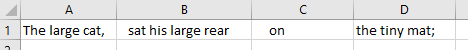
The example work sheet which we will be utilizing is illustrated below:
This worksheet can be found within this website’s GitHub Repository.
Let’s say that you wanted to create a single cell within the work sheet which contained the following formatted text:
The large cat, sat his large rear on, the tiny mat.
Typing this out ourselves, or manually formatting the text contained within each cell, seems like the direct way of completing this task. However, we will assume that achieving such is impossible in our example scenario.
TRIM()
This function, according to the Microsoft Office website:
“Removes all spaces from text except for single spaces between words. Use TRIM on text that you have received from another application that may have irregular spacing.”
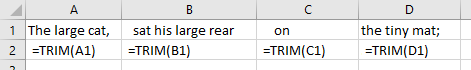
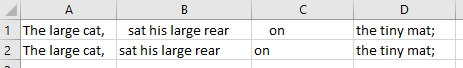
Let’s apply this function to each cell entry from columns A to D.
This is established by entering “=TRIM()” within each destination cell, with the function being initiated to target each corresponding cell.
The result is as follows:
CONCAT()
Now that the previous step has been completed, we can begin the concatenation process. Within a destination cell, (we will use E4), we will type the following code: =CONCAT(A2, " ", B2, ", ", C2, " ",D2)
Illustrated, this appears as such:
The result being:
We’ve almost completed our task. All that remains is a single modification. We must remove the “;”, at the end of the sentence, and in its place, insert a “.”. (NOTE: “CONCAT” replaces the “CONCATENATE” function which existed within the older versions of Excel. If the “CONCAT” function is not performing its task, try utilizing the “CONCATENATE” function in the same manner as illustrated above.)
LEFT() and RIGHT()
Though these functions are not immediately useful as they pertain to the completion of our task, they should nevertheless be discussed.
LEFT() and RIGHT() are two separate MS-Excel functions. Each function provides a similar task, that task being, the return of a specified number of characters from a previously indicated cell. RIGHT() and LEFT() dictate the direction of the character count.
RIGHT() – Selects characters from left to right.
LEFT() – Selects characters from right to left.
So, if for example we typed:
=LEFT(A2, 3)
into an empty cell, and A2 contained:
The large cat, The value within the destination cell would now contain:
The
Likewise, if we were to type:
=RIGHT(A2,4)
into an empty cell, and A2 contained:
The large cat,
The value within the destination cell would now contain:
cat,
RemovePuncuation()
Another useful function, which is unrelated to this exercise, is RemovePuncuation(). As the name indicates, RemovePuncuation() creates a cell entry which contains the contents of an indicated cell, with all punctuation removed.
Therefore, if we typed:
=RemovePuncuation(A2)
into an empty cell, and A2 contained:
The large cat,
The value within the destination cell would now contain:
The large cat
This function removes ALL punctuation. Therefore, all periods, commas, apostrophes, semi-colons, etc., would be removed from the text within the destination cell. Removing the Final Cell Character
We will finish our exercise by creating a new cell entry which contains the contents our original cell, with the exception of the final character (;).
This can be achieved with the code below:
=LEFT(E2, LEN(E2)-(RIGHT(E2) = ";"))
Implemented, this resembles the following:
The result being:
The initial function is specifying the removal of the semi-colon.
The subsequent function is adding a period in lieu of the removed semi-colon.
E2 is the cell value which is being targeted. This target value can be modified based on what the situation entails. The value at the end of the function “;”, can be modified to whatever the final character is (“.”, “,”, etc.) within the target cell which requires removal.