Wednesday, November 7, 2018

(R) Dimension Reduction and K-Nearest Neighbor

Continuing with the present theme of prior articles, in today’s entry, we will discuss the utilization of the R platform as it pertains to dimension reduction.

This demonstration will also include an example which seeks to illustrate the k-nearest neighbor method of analysis. Both methodologies were previously demonstrated within the SPSS platform.

If you are un-familiar with this particular methodology, or if you wish to re-familiarize yourself, please consult the following articles: Dimension Reduction (SPSS) and Nearest Neighbor / Dimension Reduction (Pt. II) (SPSS).

Example:

For this demonstration, we will be utilizing the same data set which was previously utilized to demonstrate the analytical process within SPSS. This data set can be found within this site’s GitHub Repository.


# Load the data into the R platform #

# Be sure to change the ‘filepathway’ so that it matches the file location on your #
# computer #

DimensionReduct <- read.table("C:\\filepathway\\DimensionReduction.csv", fill = TRUE, header = TRUE, sep = "," )

# First, we must remove the ‘ID’ column from the data frame #

DimensionReduct <- DimensionReduct[c(-1)]

# Next we will perform a bit of preliminary analysis with the following code: #

# The function option: ‘scale. = TRUE.’ requests scaling prior to analysis. If the data #
# frame has already been scaled, indicate ‘False’ as it pertains to this option. #

pca_existing <- prcomp(DimensionReduct, scale. = TRUE)

# Summary output can be induced from the following functions: #

summary(pca_existing)

plot(pca_existing)


Console Output:

Importance of components:
                            PC1 PC2 PC3 PC4 PC5 PC6 PC7 PC8
Standard deviation 1.4008 1.3598 1.0840 1.0114 0.87534 0.76901 0.58431 0.54010
Proportion of Variance 0.2453 0.2311 0.1469 0.1279 0.09578 0.07392 0.04268 0.03646
Cumulative Proportion 0.2453 0.4764 0.6233 0.7512 0.84694 0.92086 0.96354 1.00000


Graphical Console Output:


# To view the eigenvalues which were utilized to generate the above graph: #

eigenvals <- pca_existing$sdev^2

# To view proportional eigenvalue output #

eigenvals/sum(eigenvals)

# To view the eigenvalues which were utilized to generate the above graph: #

eigenvals <- pca_existing$sdev^2

# To view proportional eigenvalue output #

eigenvals/sum(eigenvals)

# Re-load the data into the R platform #

# Be sure to change the ‘filepathway’ so that it matches the file location on your #
# computer #

DimensionReduct <- read.table("C:\\filepathway\\DimensionReduction.csv", fill = TRUE, header = TRUE, sep = "," )

# First, we must remove the ‘ID’ column from the data frame #

DimensionReduct0 <- DimensionReduct[c(-1)]

# Download and enable the package: ‘Psych’, in order to utilize the function: ‘principal’ #

# Download and enable the package: ‘GPArotation’, in order to utilize the #
# option: ‘rotate’ #

# The ‘nfactor’ option indicates the number of dimensional factors to utilize for analysis #

# The ‘rotate’ option indicates the type of rotation methodology which will be applied #

# The code below generates the principal components requested: #

pca <- principal(DimensionReduct0, nfactors=3, rotate = "quartimax")

# We must export these scores into a accessible format. The code below achieves such: #

pcascores <- data.frame(pca$scores)

# Prior to initiating the K-Nearest Neighbors process, we must isolate the previously #
# removed ‘ID’ #

# variable in order to have it later act as a classification factor. #

cl = DimensionReduct1[,1, drop = TRUE]

# We are now prepared to perform the primary analysis. #

# ‘k = 3’ indicates the number of components to utilize for analysis. #

# Download and enable the package: ‘class’, in order to utilize the function: ‘knn’ #

KNN <- knn(pcascores, pcascores, cl, k = 3)

# With the analysis completed, we must now assemble all of the outstanding #
# components into a single data frame. #

FinalFrame <- data.frame(DimensionReduct , pcascores)

FinalFrame$KNN <- KNN


This data frame should resemble the following:


# (with the package: ‘plot3D’, downloaded and enabled) #

# Create a 3D graphical representation for the K-Nearest Neighbor analysis #

scatter3D(FinalFrame$RC3, FinalFrame$RC2, FinalFrame$RC1, phi = 0, bty = "g", pch = 20, cex = 2)


# Create data labels for the graphic #

text3D(FinalFrame$RC3, FinalFrame$RC2, FinalFrame$RC1, labels = FinalFrame$ID,
add = TRUE, colkey = FALSE, cex = 1)


If you would prefer to have the data presented in a graphical format which is three dimensional and rotatable, you could utilize the following code:

# Enable 'rgl' #

# https://www.r-bloggers.com/turning-your-data-into-a-3d-chart/ #

plot3d(FinalFrame$RC3, FinalFrame$RC2, FinalFrame$RC1, col = blues9, size=10)


This creates a new window which should resemble the following:


If you drag your mouse cursor across the graphic while holding the left mouse button, you can rotate the image display. 

One final note un-related to our example demonstrations. If you are performing a nearest neighbor analysis, and your data has not been previously scaled, be sure to scale your data prior to proceeding with the procedure.

Tuesday, November 6, 2018

(R) K-Means Cluster

In continuing with the premise of the prior article, we will again explore a previously discussed methodology which was last demonstrated within the SPSS platform.

If you are un-familiar with this particular methodology, or if you wish to re-familiarize yourself, please consult the following article: K-Means Cluster (SPSS).

Example:

For this demonstration, we will be utilizing the same data set which was previously utilized to demonstrate the analytical process within the SPSS platform. This data set can be found within this site’s GitHub Repository.


# Load the data into the R platform #

# Be sure to change the ‘filepathway’ so that it matches the file location on your #

# computer #

KMeans <- read.table("C:\\filepathway\\kmeans.csv", fill = TRUE, header = TRUE, sep = "," )

# We’re going to assume that the variables: ‘ZCont_Var1’, ‘ZCont_Var2’, ‘ZCont_3’ # 

# are not included within the initial data frame. #

# Therefore, we must scale the variables: ‘Cont_Var1, ‘Cont_Var2’, ‘Cont_Var3’ prior to # 
# performing analysis. #

ScaledKMeans <- scale(KMeans[4:6])

# In this example, we are going to create a two cluster model. Also, we will be utilizing #

# an ‘n’ value of 10. This figure represents the number of iterations which will be # 
# attempted while the underlying mechanism of the model decides on an # 
# appropriate configuration. #

ScaledKMeansCluster <- kmeans(ScaledKMeans, 2, nstart = 10)

# Once the model has been created, we will assign the cluster values to a data frame #

# in order to discern which cluster categorizations pertain to each observational value. #

KMeans$ClusterID <- as.factor(ScaledKMeansCluster$cluster)

# Finally, we will graph the results of the analysis. The variables which will represent #

# the scales of the graph’s axis are: Zcont_Var1 and Zcont_Var2. #

# To achieve the desired result, we must download and enable the package: “ggplot2” #


ggplot(KMeans, aes(KMeans$Zcont_Var1, KMeans$Zcont_Var2, color = KMeans$ClusterID)) + geom_point()

Console Output:

(R) Hierarchical Cluster

Previously, we discussed how to appropriately perform hierarchical cluster analysis within the SPSS platform. In this entry, we will discuss the same method of analysis, however, we will be utilizing the R platform to perform this function.

If you are un-familiar with this particular methodology, or if you wish to re-familiarize yourself, please consult the following article: Hierarchical Cluster (SPSS).

Example:

For this demonstration, we will be utilizing the same data set which was previously utilized to demonstrate the process within the SPSS platform. This data set can be found within this site’s GitHub Repository.


# Load the data into the R platform #

# Be sure to change the ‘filepathway’ so that it matches the file location on your #

# computer #

HFrame <- read.table("C:\\filepathway\\hcluster.csv", fill = TRUE, header = TRUE, sep = "," )

# After specifying the variables to analyze (Cont_Var1, Cont_Var2, Cont_Var3), # 

# we must utilize the dist() function to create a matrix which calculates the distance # 
# between the variable observation values. #

clusters0 <- (dist(HFrame[, 4:6]))

# Now we are ready to prepare our model. "hclust()" is the function which we will #

# utilize to enable model generation. There are other agglomeration methods which #
# can specified to generate different model variations. However, in the case of our #
# example, we will be utilizing the “average” method, as it produces a model which #
# best resembles the equivalent SPSS output. # 

clusters1 <- hclust(clusters0, method = "average" , members = NULL)

# Next, we will download and enable the package: “ggdendro”. This package allows #

# for the production of enhanced visualizations as it pertains hierarchical model # 
# illustration. #

# Rotate the plot and remove default theme #

ggdendrogram(clusters1, rotate = TRUE, theme_dendro = FALSE)

# The above code should produce an output illustration which resembles an SPSS #

# graphic. #


# As was also the case within the SPSS example demonstration, we will choose 5 #
# clusters from which to classify our data observations. #

# k = 5 is designating the number of clusters to utilize for cluster categorization #

clusters2 <- cutree(clusters1, k = 5)

# Finally, we will download and enable the package: “dplyr"  in order to utilize the #

# mutate()  function. #

# This function allows us to create a new data frame which contains variable #

# observational values and their corresponding categorical distinctions. #

finalcluster <- mutate(HFrame, cluster = clusters2)

# The final data frame will resemble the following illustration #

Monday, October 22, 2018

(R) Making Predictions with predict()

In today’s article we will be discussing a function which has been utilized within previous entries, but within the context of this website, has never been fully covered in-depth. The function which I am referring to is: “predict()”.

What predict() achieves is rather simple, in that, it provides an applied output as it pertains to applying a linear model to observational data.

Let’s delve right in with a few examples of this application.

Linear Regression

# Model Creation #

x <- c(27, 34, 22, 30, 17, 32, 25, 34, 46, 37)

y <- c(70, 80, 73, 77, 60, 93, 85, 72, 90, 85)

linregress <- (lm(y ~ x))

# Build Predictive Structure #

predictdataframe <- data.frame(x)

# Print Predicted Values to Console #

predict(linregress, predictdataframe)

# Organize predicted values in a variable column adjacent to observed values #

# Store Predicted Values in Variable #

predictedvalues <- predict(linregress, predictdataframe)

# Add Variables to Data Frame #

predictdataframe$y <- y

predictdataframe$predictedvalues <- predictedvalues

# View Results #

predictdataframe


# Console Output #

x y predictedvalues
1 27 70 75.60686
2 34 80 81.56332
3 22 73 71.35224
4 30 77 78.15963
5 17 60 67.09763
6 32 93 79.86148
7 25 85 73.90501
8 34 72 81.56332
9 46 90 91.77441
10 37 85 84.11609


Loglinear Analysis

# Model Creation #

Obese <- c("Yes", "Yes", "No", "No")

Smoking <- c("Yes", "No", "Yes", "No")

Count <- c(5, 1, 2, 2)

DataModel <- glm(Count ~ Obese + Smoking , family = poisson)

# Build Predictive Structure #

predictdataframe <- data.frame(Obese, Smoking)

# Print Predicted Values to Console #

exp(predict(DataModel, predictdataframe))

# Organize predicted values in a variable column adjacent to observed values #

# Store Predicted Values in Variable #

predictedvalues <- predict(DataModel, predictdataframe)

# Add Variables to Data Frame #

predictdataframe$Obese <- Obese

predictdataframe$Smoking <- Smoking

predictdataframe$Count <- Count

predictdataframe$predictedvalues <- exp(predictedvalues)

# View Results #

predictdataframe

# Console Output #


Obese Smoking Count predictedvalues
1 Yes Yes 5 4.2
2 Yes No 1 1.8
3 No Yes 2 2.8
4 No No 2 1.2

Probit Regression 


# Create data vectors #

age <- c(55.00, 45.00, 33.00, 22.00, 34.00, 56.00, 78.00, 47.00, 38.00, 68.00, 49.00, 34.00, 28.00, 61.00, 26.00)

obese <- c(1.00, .00, .00, .00, 1.00, 1.00, .00, 1.00, 1.00, .00, 1.00, 1.00, .00, 1.00, .00)

smoking <- c(1.00, .00, .00, 1.00, 1.00, 1.00, .00, .00, 1.00, .00, .00, 1.00, .00, 1.00, 1.00)

cancer <- c(1.00, .00, .00, 1.00, .00, 1.00, .00, .00, 1.00, 1.00, .00, 1.00, 1.00, 1.00, .00)

# Combine data vectors into a single data frame #

cancerdata <- data.frame(cancer, smoking, obese, age)

# Create Probit Model #

probitmodel <- glm(cancer ~ smoking + obese + age, family=binomial(link= "probit"), data=cancerdata)

# Build Predictive Structure #

predictdataframe <- data.frame(smoking, obese, age)

# Print Predicted Values to Console #

plogis(predict(probitmodel, predictdataframe ))

# Organize predicted values in a variable column adjacent to observed values #

# Store Predicted Values in Variable #

predictedvalues <- predict(probitmodel, predictdataframe )

# Add Variables to Data Frame #

predictdataframe$smoking <- smoking

predictdataframe$obese <- obese

predictdataframe$age <- age

predictdataframe$cancer <- cancer

predictdataframe$predictedvalues <- plogis(predictedvalues)

# View Results #

predictdataframe

# Console Output #


smoking obese age cancer predictedvalues
1 1 1 55 1 0.7098209
2 0 0 45 0 0.3552599
3 0 0 33 0 0.3076726
4 1 0 22 1 0.6338307
5 1 1 34 0 0.6267316
6 1 1 56 1 0.7134978
7 0 0 78 0 0.4988303
8 0 1 47 0 0.3088181
9 1 1 38 1 0.6433412
10 0 0 68 1 0.4541625
11 0 1 49 0 0.3165195
12 1 1 34 1 0.6267316
13 0 0 28 1 0.2889239
14 1 1 61 1 0.7314569
15 1 0 26 0 0.6503007


Logistic Regression Analysis (Non-Binary Categorical Variables) 

# Non-Binary Categorical Variables #

Age <- c(55, 45, 33, 22, 34, 56, 78, 47, 38, 68, 49, 34, 28, 61, 26)

Obese <- c(1,0,0,0,1,1,0,1,1,0,1,1,0,1,0)

Smoking <- c(1,0,0,1,1,1,0,0,1,0,0,1,0,1,1)

Cancer <- c(1,0,0,1,0,1,0,0,1,1,0,1,1,1,0)

White <- c(1,1,1,0,0,0,0,0,0,0,0,0,0,0,0)

African_American <- c(0,0,0,1,1,1,0,0,0,0,0,0,0,0,0)

Asian <- c(0,0,0,0,0,0,1,1,1,0,0,0,0,0,0)

Indian <- c(0,0,0,0,0,0,0,0,0,1,1,1,0,0,0)

Native_American <- c(0,0,0,0,0,0,0,0,0,0,0,0,1,1,1)

CancerModelLogII <- glm(Cancer~ Age + Obese + Smoking + White + African_American + Asian + Indian + Native_American, family=binomial)

# Build Predictive Structure #

predictdataframe <- data.frame(Age, Obese, Smoking, White, African_American, Asian, Indian, Native_American)

# Print Predicted Values to Console #

plogis(predict(CancerModelLogII, predictdataframe ))

# Organize predicted values in a variable column adjacent to observed values #

# Store Predicted Values in Variable #

predictedvalues <- predict(CancerModelLogII, predictdataframe )

# Add Variables to Data Frame #

predictdataframe$Age <- Age

predictdataframe$Obese <- Obese

predictdataframe$Smoking <- Smoking

predictdataframe$White <- White

predictdataframe$African_American <- African_American

predictdataframe$Asian <- Asian

predictdataframe$Indian <- Indian

predictdataframe$Native_American <- Native_American

predictdataframe$Cancer <- Cancer

predictdataframe$predictedvalues <- plogis(predictedvalues)

# View Results #


predictdataframe

# Console Output #


Age Obese Smoking White African_American Asian Indian Native_American Cancer

1 55 1 1 1 0 0 0 0 1

2 45 0 0 1 0 0 0 0 0

3 33 0 0 1 0 0 0 0 0

4 22 0 1 0 1 0 0 0 1

5 34 1 1 0 1 0 0 0 0

6 56 1 1 0 1 0 0 0 1

7 78 0 0 0 0 1 0 0 0

8 47 1 0 0 0 1 0 0 0

9 38 1 1 0 0 1 0 0 1

10 68 0 0 0 0 0 1 0 1

11 49 1 0 0 0 0 1 0 0

12 34 1 1 0 0 0 1 0 1

13 28 0 0 0 0 0 0 1 1

14 61 1 1 0 0 0 0 1 1

15 26 0 1 0 0 0 0 1 0

predictedvalues

1 0.74330743

2 0.15053796

3 0.10615461

4 0.64063327

5 0.60103365

6 0.75833308

7 0.32059004

8 0.08677812

9 0.59263184

10 0.69613463

11 0.40773029

12 0.89613509

13 0.23207436

14 0.91405050

15 0.85387513

Logistic Regression Analysis

# Model Creation #

Age <- c(55, 45, 33, 22, 34, 56, 78, 47, 38, 68, 49, 34, 28, 61, 26)

Obese <- c(1,0,0,0,1,1,0,1,1,0,1,1,0,1,0)

Smoking <- c(1,0,0,1,1,1,0,0,1,0,0,1,0,1,1)

Cancer <- c(1,0,0,1,0,1,0,0,1,1,0,1,1,1,0)

CancerModelLog <- glm(Cancer~ Age + Obese + Smoking, family=binomial)

# Build Predictive Structure #

predictdataframe <- data.frame(Age, Obese, Smoking, Cancer)

# Print Predicted Values to Console #

plogis(predict(CancerModelLog, predictdataframe ))

# Organize predicted values in a variable column adjacent to observed values #

# Store Predicted Values in Variable #

predictedvalues <- predict(CancerModelLog, predictdataframe )

# Add Variables to Data Frame #

predictdataframe$Age <- Age

predictdataframe$Obese <- Obese

predictdataframe$Smoking <- Smoking

predictdataframe$Cancer <- Cancer

predictdataframe$predictedvalues <- plogis(predictedvalues)

# View Results #

predictdataframe

# Console Output #


Age Obese Smoking Cancer predictedvalues
1 55 1 1 1 0.8102649
2 45 0 0 0 0.2686795
3 33 0 0 0 0.2043280
4 22 0 1 1 0.7018502
5 34 1 1 0 0.6952985
6 56 1 1 1 0.8148105
7 78 0 0 0 0.4958797
8 47 1 0 0 0.2090126
9 38 1 1 1 0.7199845
10 68 0 0 1 0.4219139
11 49 1 0 0 0.2190519
12 34 1 1 1 0.6952985
13 28 0 0 1 0.1811344
14 61 1 1 1 0.8362786
15 26 0 1 0 0.7262143
Function Functionality

For all of the time saving capability that the predict() function provides, its internal structure is rather simple. All that is necessary is that the function be called, along with the required model, and the independent variable data which will be utilized to provide predictions.

This concept illustrated, would resemble the following:

predict(linearmodel, new_data_frame_containing_idependent_variables)

For more information pertaining to this function and its customizable options, please consult the like below:

https://www.rdocumentation.org/packages/raster/versions/2.7-15/topics/predict

That’s all for now. Stay ambitious, Data Heads!

(R) Finding the Best Linear Model w/stepAIC()

In today’s article, we will continue to address reader inquiries. Recently, I was contacted by an analyst who shared a concern pertaining to linear modeling, specifically, what is the most optimal manner in which a user may create an efficient linear model under the circumstances in which a data frame contains numerous independent variables? The trial-and-error technique isn’t a terrible option absent an abundant number of independent variables. However, when encountering a data frame which contains hundreds of independent variables, a more efficient method is necessary.

Thankfully, for the R user, a tenable solution exists.

Utilizing the “MASS” Package to find the Best Linear Model

As the title suggests, this technique requires that the “MASS” package be downloaded and enabled.

For this example, we will be utilizing a rather lengthy data frame. The sample data frame: “BiTestData.csv”, can be found amongst other files within the site’s corresponding GitHub.

Once the .CSV file has been downloaded, it can be loaded into the R platform through the utilization of the following code:

DataFrameA <- read.table("C:\\Users\\UserName\\Desktop\\BiTestData.csv", fill = TRUE, header = TRUE, sep = "," )

The pathway must be altered to reflect the file destination within your working environment.

To demonstrate the capability of the “MASS” package, we will first create a logistic regression model within R through the utilization of the glm() function.

bimodel <- glm(Outcome ~., family=binomial, data=DataFrameA)

summary(bimodel)

# Console Output: #

Call:
glm(formula = Outcome ~ ., family = binomial, data = DataFrameA)

Deviance Residuals:
Min 1Q Median 3Q Max
-1.35061 -0.00005 -0.00005 -0.00004 1.77333

Coefficients:
Estimate Std. Error z value Pr(>|z|)
(Intercept) -2.032e+01 1.980e+03 -0.010 0.992
VarA -6.206e-02 1.269e+04 0.000 1.000
VarB 2.036e+01 1.254e+04 0.002 0.999
VarC -4.461e-01 5.376e-01 -0.830 0.407
VarD -5.893e-01 5.699e-01 -1.034 0.301
VarE 4.928e-01 9.435e-01 0.522 0.601
VarF -2.334e-02 5.032e-02 -0.464 0.643

(Dispersion parameter for binomial family taken to be 1)

Null deviance: 142.301 on 144 degrees of freedom
Residual deviance: 84.197 on 138 degrees of freedom
AIC: 98.197

Number of Fisher Scoring iterations: 19

We will now measure the model’s predictive capacity through the application of the Nagelkerke R-Squared methodology.

# Generate Nagelkerke R Squared #

# Download and Enable Package: "BaylorEdPsych" #

PseudoR2(bimodel)


# Console Output #

McFadden Adj.McFadden Cox.Snell

0.40831495 0.29587694 0.33015814

Nagelkerke McKelvey.Zavoina Effron

0.52807741 0.96866777 0.33839985

Count Adj.Count AIC

0.81379310 0.03571429 98.19715620

Corrected.AIC

99.01467445

Notice that the Nagelkerke R-Squared value is .528, which by most standards, indicates that the model possesses a fairly decent predictive capacity. In prior articles related to Logistic Regression Analysis, we discussed how this statistic is utilized in lieu of the traditional R-Squared figure to measure the strength of predictability in logistic regression models. However, another statistic which is illustrated within this output, the AIC, or Akaike Information Criterion, was not specifically mentioned.

AIC differs from both the Nagelkerke R-Squared value and the traditional R-Squared statistic, in that, it does not measure how well the current model explains the observed data, but instead, seeks to estimate model accuracy as it is applied to new observational data. R-Squared measures training error, while AIC acts as an estimate of the test error, thus, accounting for bias and variance.

As was mentioned in the prior article pertaining to Logistic Regression, when measuring the strength of model predictability, the Nagelkerke R-Squared value is the most easily interpretable.

The reason which necessitates the discussion of the Akaike Information Criterion is its utilization as the mechanism for which model optimization is determined by the stepAIC function. As it concerns interpretability, the smaller the AIC value, the better the model is assumed to perform when applied to new observational sets.

Let us now apply the stepAIC() function to our linear model and observe the results.

# With the “MASS” package downloaded and enabled #

stepAIC(bimodel)


This produces the output:

# Console Output #


Start: AIC=98.2

Outcome ~ VarA + VarB + VarC + VarD + VarE + VarF

Df Deviance AIC

- VarA 1 84.197 96.197

- VarF 1 84.414 96.414

- VarE 1 84.479 96.479

- VarC 1 84.891 96.891

- VarD 1 85.290 97.290

- VarB 1 86.022 98.022

<none> 84.197 98.197

Step: AIC=96.2

Outcome ~ VarB + VarC + VarD + VarE + VarF

Df Deviance AIC

- VarF 1 84.414 94.414

- VarE 1 84.479 94.479

- VarC 1 84.891 94.891

- VarD 1 85.290 95.290

<none> 84.197 96.197

- VarB 1 96.542 106.542

Step: AIC=94.41

Outcome ~ VarB + VarC + VarD + VarE

Df Deviance AIC

- VarE 1 84.677 92.677

- VarC 1 84.999 92.999

- VarD 1 85.586 93.586

<none> 84.414 94.414

- VarB 1 96.757 104.757

Step: AIC=92.68

Outcome ~ VarB + VarC + VarD

Df Deviance AIC

- VarC 1 85.485 91.485

- VarD 1 85.742 91.742

<none> 84.677 92.677

- VarB 1 132.815 138.815

Step: AIC=91.49

Outcome ~ VarB + VarD

Df Deviance AIC

- VarD 1 86.557 90.557

<none> 85.485 91.485

- VarB 1 139.073 143.073

Step: AIC=90.56

Outcome ~ VarB

Df Deviance AIC

<none> 86.557 90.557

- VarB 1 142.301 144.301

Call: glm(formula = Outcome ~ VarB, family = binomial, data = DataFrameA)

Coefficients:

(Intercept) VarB

-20.57 20.34

Degrees of Freedom: 144 Total (i.e. Null); 143 Residual

Null Deviance: 142.3

Residual Deviance: 86.56 AIC: 90.56

As illustrated, the ideal model that the stepAIC() function suggests is:


bimodel <- glm(Outcome ~ VarB, family=binomial, data=DataFrameA)

summary(bimodal)


# Console Output #

Call:
glm(formula = Outcome ~ VarB, family = binomial, data = DataFrameA)

Deviance Residuals:
Min 1Q Median 3Q Max
-1.08424 -0.00005 -0.00005 -0.00005 1.27352

Coefficients:
Estimate Std. Error z value Pr(>|z|)
(Intercept) -20.57 1957.99 -0.011 0.992
VarB 20.34 1957.99 0.010 0.992

(Dispersion parameter for binomial family taken to be 1)

Null deviance: 142.301 on 144 degrees of freedom
Residual deviance: 86.557 on 143 degrees of freedom
AIC: 90.557

Number of Fisher Scoring iterations: 19

Now let’s measure the model’s predictive capacity.

# Generate Nagelkerke R Squared #

# Download and Enable Package: "BaylorEdPsych" #

PseudoR2(bimodel)

# Console Output #


McFadden Adj.McFadden Cox.Snell Nagelkerke McKelvey.Zavoina Effron Count Adj.Count

0.3917303 0.3495661 0.3191667 0.5104969 0.9686596 0.3114910 NA NA

AIC Corrected.AIC

90.5571588 90.6416659 


As you can observe from the information presented above, the Nagelkerke (0.51) value has been lowered slightly. However, the AIC (90.56) value has fallen by a much more substantial amount. This should be viewed as a positive occurrence. The lower the AIC value, the more the model is able to appropriately account for new observational data. The slight decline in the Nagelkerke value is significantly offset by the large AIC value decline, therefore, we can conclude that given the dependent variables present within the data set, that the model below contains the optimal structuring format:


bimodel <- glm(Outcome ~ VarB, family=binomial, data=DataFrameA)

For more information pertaining to The Akaike Information Criterion (AIC):

https://en.wikipedia.org/wiki/Akaike_information_criterion

For more information pertaining to the Akaike Information Criterion and the R-Squared statistic as quantifiable measurements:

https://stats.stackexchange.com/questions/140965/when-aic-and-adjusted-r2-lead-to-different-conclusions

That’s all for now, Data Heads! Stay subscribed for more substantive concepts.

Saturday, October 20, 2018

Analyzing Chi-Square Output (SPSS)

In prior articles, we discussed how to generate output within the SPSS platform as it pertains to the chi-squared methodology. The purpose of this entry, is to answer inquires which I have received related to the chi-squared analysis. Specifically, how to properly assess Risk Estimate and Cross-Tabulation tables.

To aid in the assessment of these output types, I have created the following charts and corresponding keys. Though the data which was utilized to create these tables is fictional, the fundamental aspects of the charts remain un-impacted.

Cross-Tabulation Chart and Key


a = Individuals who smoked and received a cancer diagnosis.

b = Individuals who smoked and did not receive a cancer diagnosis.

c = Total number of individuals who were smokers.

d = Percentage of individual who were smokers and received a cancer diagnosis.

e = Percentage of individuals who were smokers and did not received a cancer diagnosis.

f = Total percentage of individual smokers.

g = Individuals who did not smoke and received a cancer diagnosis.

h = Individuals who did not smoke and did not receive a cancer diagnosis.

I = Total number of individuals who were not smokers.

j = Percentage of individuals who were not smokers and received a cancer diagnosis.

k = Percentage of individuals who were not smokers and did not receive a cancer diagnosis.

l = Total percentage of individual non-smokers.

m = Total number of individuals diagnosed with cancer.

n = Total number of individuals not diagnosed with cancer.

o = Total number of individuals surveyed.

p = Percentage of total surveyed individuals who were diagnosed with cancer.

q = Percentage of total surveyed individuals who were not diagnosed with cancer.

r = Total percentage of surveyed individuals.


Risk Estimate Chart and Key


a = The odds ratio indicates that the odds of finding cancer within an individual who smokes, as compared to an individual who does not smoke, is 9.333.

b = The outcome of this event (Cancer Diagnosis) was 2.667 times more likely to occur within the smoker group.

c = The number of total individuals surveyed.


Calculating Relative Outcome: | 1 – risk estimate value | * 100

| 1 – 2.667 | * 100 = 167

Risk ratios indicated that the risk of the outcome variable (cancer), within the category of smokers, increased by 167 % relative to the group of non-smokers.

(R) Importing Strange Data Formats

Today’s entry will discuss additional aspects pertaining to the R data importing process.

Importing an Excel File into the R Platform

To import a Microsoft excel file into the R platform, you must first download the R package: “readxl”. It is important to note, prior to proceeding, that files read into R from excel still maintain the escape characters that were present within the original format (\r, \t, etc.)

# With the package: ‘readxl’ downloaded and enabled #

# Import a single workbook sheet #

ExcelFile <- read_excel("A:\\FilePath\\File.xlsx")

# Import a single workbook sheet by specifying a specific sheet (3) for import #

ExcelFile <- read_excel("A:\\FilePath\\File.xlsx",  sheet = 3)


Export a Data Frame with a Specified Delineator

There may be instances in which another party may request that you utilize a specific character to act as a data delineator. In the case of our example, we will be utilizing the “|” (pipe-character) to demonstrate functionality.

# Export Pipe-Delineated Data #

write.table(PipeExport, file = "A\\FilePath\\PipeExport.txt", sep = "|", col.names = NA, row.names = TRUE)

Import a Data Frame with a Specified Delineator

There will also be instances, in which another party may provide data which utilizes a specific character to act as a data delineator. Again for our example, we will be utilizing the “|” (pipe-character) to demonstrate functionality.

PipeImport <- read.delim("A\\FilePath\\PipeImport.txt", fill = TRUE, header = TRUE, sep = "|")

That’s all for now. Stay subscribed, Data Heads!

Wednesday, October 17, 2018

Syntax – Pt. (II) (SPSS)

In a previous article, we discussed how to create SPSS syntax. Since that article appeared on this website, I have received numerous inquiries, both online and off, pertaining to syntax functionality. In this article, I hope to further demonstrate additional aspects of SPSS syntax which will increase proficiency within the subject.

Creating a New Variable to act as a Variable Flag

If an SPSS data frame contained six variables, and from such, you wished to create an additional variable to act as a flag to identify the instances in which one of the six variables was equal to the number: “1”, the line of code to establish this task would resemble the following:

if(Var1 = 1 OR Var2 = 1 OR Var3 = 1 OR Var4 = 1 OR Var5 = 1 OR Var6 = 1) VarFlag = 1.
exe.


In the case of our example above, a new variable, “VarFlag”, would be created and populated with the value of “1” whenever any of the aforementioned values equaled “1”.

If instead, you wished to only identify instances in which “Var1” and “Var2” are equal to “1”, the code below could be utilized:

if (
Var1 = 1 AND Var2 = 1
) VarFlag = 1.
EXECUTE.


If you wished to flag for instances in which “Var1” contained a missing value, the following code be utilized to achieve such:

if ( MISSING(Var1) ) VarFlag = 1.
exe.


Finally, if you desired to only identify instances in which a text field contains a value, the following code could be utilized:

if (Var1 NE "") VarFlag = 1.
exe.


That’s all for now, Data Heads. I heavily encourage you to research this topic to better build your arsenal of analytic tools.

Saturday, September 1, 2018

(Python) Graphing Data with “Matplotlib”

"Matplotlib" is a Python package with enables the creation of graphical data outputs within the Python platform. As mentioned in a prior article, in most cases, it may be easier and even more aesthetically pleasing to graph data within an Excel workbook. However, there are instances in which "matplotlib" may be able to provide a graphical variation which is un-available within other software suites.

In this article, we will examine a few different variations of graphical outputs which can be produced through the utilization of the "matplotlib" package. With the fundamentals firmly grasped, you should then possess the ability to conduct further research as it pertains to the more eclectic options which enable less frequently utilized visuals.

A link to the package website is featured at the end of this entry. There, you can find numerous demonstrations and templates which illustrate the package's full capabilities.

For demonstrative purposes, we will again be utilizing the data frame: "PythonImportTestIII".

This data frame can be downloaded from this website's GitHub Repository:

GitHub 

(Files are sorted in chronological order by coinciding entry date)

The file itself is in .csv format, and must be imported prior to analysis.

All example require that the following lines be included within the initial code file:

# Enable Matplotlib #

import matplotlib.pyplot as plt

# Enable Pandas #

import pandas


Basic Line Graph

Let's start by demonstrating a basic line graph.

# Adjust output dimensions #

plt.figure(figsize=(5,5))

# Sort data by the X-Axis #

# Not performing this steps causes your data to resemble a scribble #

PythonImportTestIII = PythonImportTestIII.sort_values(by = ['VarA'])

# Plot the data #

plt.plot(PythonImportTestIII['VarA'], PythonImportTestIII['VarD'])

# Output the newly ceated graphic #

plt.show()


Not incredibly inspiring. Let's add a few more details to make our graph a bit more complete.

# Adjust output dimensions #

plt.figure(figsize=(5,5))

# Sort data by the X-Axis #

# Not performing this steps causes your data to resemble a scribble #

PythonImportTestIII = PythonImportTestIII.sort_values(by = ['VarA'])

# Plot the data #

plt.plot(PythonImportTestIII['VarA'], PythonImportTestIII['VarD'])

# Assign axis labels and graph title #

xlab = 'X-Axis Label'

ylab = 'Y-Axis Label'

title = 'Graph Title'

# Assign axis labels and graph title to graphical output #

plt.xlabel(xlab)

plt.ylabel(ylab)

plt.title(title)

# Output the newly created graphic #

plt.show()


Now let's take it to another level by adding a grid to the background of our data graphic.

# Adjust output dimensions #

plt.figure(figsize=(5,5))

# Sort data by the X-Axis #

# Not performing this steps causes your data to resemble a scribble #

PythonImportTestIII = PythonImportTestIII.sort_values(by = ['VarA'])

# Plot the data #

plt.plot(PythonImportTestIII['VarA'], PythonImportTestIII['VarD'])

# Assign axis labels and graph title #

xlab = 'X-Axis Label'

ylab = 'Y-Axis Label'

title = 'Graph Title'

# Assign axis labels and graph title to graphical output #

plt.xlabel(xlab)

plt.ylabel(ylab)

plt.title(title)

# Add a grid to the graph #

plt.grid()

# Output the newly created graphic #

plt.show()


Line Graph with Connected Data Points

If you're anything like yours truly, you'd prefer to have data points specifically displayed within the graphical output. To achieve this, utilize the following code:

# Adjust output dimensions #

plt.figure(figsize=(5,5))

# Sort data by the X-Axis #

# Not performing this steps causes your data to resemble a scribble #

PythonImportTestIII = PythonImportTestIII.sort_values(by = ['VarA'])

# Plot the scattered data #

plt.scatter(PythonImportTestIII['VarA'], PythonImportTestIII['VarD'])

# Plot the data lines #

plt.plot(PythonImportTestIII['VarA'], PythonImportTestIII['VarD'])

# Assign axis labels and graph title #

xlab = 'X-Axis Label'

ylab = 'Y-Axis Label'

title = 'Graph Title'

# Assign axis labels and graph title to graphical output #

plt.xlabel(xlab)

plt.ylabel(ylab)

plt.title(title)

# Add a grid to the graph #

plt.grid()

# Output the newly created graphic #

plt.show()


Yes, life is beautiful.

Scatter Plot

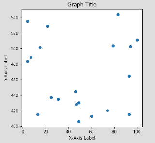
To create a pure scatter plot, utilize the code below:

# Adjust output dimensions #

plt.figure(figsize=(5,5))

# Plot the scattered data #

plt.scatter(PythonImportTestIII['VarA'], PythonImportTestIII['VarD'])

# Assign axis labels and graph title #

xlab = 'X-Axis Label'

ylab = 'Y-Axis Label'

title = 'Graph Title'

# Assign axis labels and graph title to graphical output #

plt.xlabel(xlab)

plt.ylabel(ylab)

plt.title(title)

# Output the newly created graphic #

plt.show()


Histogram

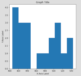
To create a histogram, try implementing the following code:

# Adjust output dimensions #

plt.figure(figsize=(6,6))

# Create a histogram for the data #

plt.hist(PythonImportTestIII['VarD'])

# Assign axis labels and graph title #

xlab = 'X-Axis Label'

ylab = 'Y-Axis Label'

title = 'Graph Title'

# Assign axis labels and graph title to graphical output #

plt.xlabel(xlab)

plt.ylabel(ylab)

plt.title(title)

# Output the newly created graphic #

plt.show()


Vertical Bar Chart

To create a vertical bar chart, utilize the code below:

# Create a vertical bar chart for the data #

plt.bar(PythonImportTestIII['VarC'], PythonImportTestIII['VarD'])

# Assign axis labels and graph title #

xlab = 'X-Axis Label'

ylab = 'Y-Axis Label'

title = 'Graph Title'

# Assign axis labels and graph title to graphical output #

plt.xlabel(xlab)

plt.ylabel(ylab)

plt.title(title)

# Output the newly created graphic #

plt.show()


Horizontal Bar Chart

The code to plot a horizontal bar chart is only slightly different:

# Create a horizontal bar chart for the data #

plt.barh(PythonImportTestIII['VarC'], PythonImportTestIII['VarD'])

# Assign axis labels and graph title #

xlab = 'X-Axis Label'

ylab = 'Y-Axis Label'

title = 'Graph Title'

# Assign axis labels and graph title to graphical output #

plt.xlabel(xlab)

plt.ylabel(ylab)

plt.title(title)

# Output the newly created graphic #

plt.show()


Conclusion

The fundamental graphics which I have demonstrated are by no means an adequate summarization of what is offered within the "matplotlib" package. All sorts of additional options exist which include, but are not limited to: error bars, color, multiple lines within a single line graph, stacked bar charts, etc. It isn't an exaggeration to state that an entire blog could be dedicated just to demonstrate the various functionalities which exist inherently with the "matplotlib" package.

Therefore, for more information related to the functionality of this package, I would recommend performing independent research related to the topic. Or, you could visit the package creators' website, which includes numerous additional templates and examples:

Matplotlib Organization

That's all for now. Stay tuned, Data Monkeys!

(Python) Data Frame Maintenance

The topic of today's post is: Data Frame Maintenance within the Python platform, specifically pertaining to data imported through the utilization of the “pandas” package.

All of the exercises featured within this article require the following file to be successfully demonstrated:

PythonImportTestIII.csv

This file can be found within the exercise code and example data set repository:

GitHub Repository

Files are sorted based on article date.

Also, for any of these examples to work, you must be sure to include:

import pandas

import numpy


within the first initial few lines of your Python program code.

Be sure to re-import the data set after performing an example which modifies the underlying data structure.

Checking Data Integrity

After your data has been successfully imported into Python, you should check the integrity of the data structure to ensure that all of the original data was imported correctly. Listed below, are some of the commands that can be utilized to ensure that data integrity was maintained.

If the utilization of this command is infeasible due to the size of the data frame, you could instead utilize the head or tail commands.

The head command template is:

<DataFrameName>.head(<number of rows to display>)

Executing this command will display the first n number of rows contained within the data frame.

# Example: #

# Print the first 10 rows of the data set #

PythonImportTestIII.head(10)


The tail command template is:

<DataFrameName>.tail(<number of rows to display>)

Executing this demand will display the last n number of rows contained within the data frame.

# Example: #

# Print the last 5 rows of the data set #

PythonImportTestIII.tail(5)


Adding a List as a Column

For this example, we'll pretend that you wanted to add a new column in the form of a list, to an existing data frame.

# Add Column #

# Create List #

VarG = [1,2,3,4,5,6,7,8,9,10,11,12,13,14,15,16,17,18,19,20]

# Modify List into Panda Series #

VarG = pandas.Series(VarG)

# Add Column as Panda Series #

PythonImportTestIII['VarG'] = VarG.values

# Print Results #

print(PythonImportTestIII)


To demonstrate the scenario in which the list possesses a length which is less that observational size of the data frame:

# Add Column of Un-equal Length #

# Create List #

VarH = [4,5,6,7,8,9,10,11,12,13,14,15,16,17,18,19,20]

# Modify List into Panda Series #

newvar = pandas.Series(VarH)

# Rename Column within Data Frame #

newvar.name = 'VarH'

# Add Column to Data Frame #

PythonImportTestIII = pandas.concat([PythonImportTestIII, newvar], axis=1)

# Print Results #

print(PythonImportTestIII)

Adding an Observation to a Data Frame

In the case of adding an additional row (observation) to an already existent data frame, the following code can be utilized.

We must first code the entries that we wish to add in the same manner in which the initial data frame is encoded.

newobservation = pandas.DataFrame({'VarA': ['30'],

'VarB': ['1000'],

'VarC': ['833'],

'VarD': ['400']},

index = [20])


We will print the row observation to illustrate its structure.

print(newobservation)

To provide this addition to the existing data frame, the following code can be utilized:

PythonImportTestIII = pandas.concat([PythonImportTestIII, newobservation])

Again, we will print to illustrate the structure of the amended data frame:

print(PythonImportTestIII)

Changing a Column Name

Let's say, for example, that you are working with the data frame named: "PythonImportTestIII". For whatever reason, the first column of this particular data frame needs to be re-named. The code to accomplish this task is below:

DataFrame.rename(columns={'originalcolumnname':'newcolumnname'}, inplace = True)

So, if you wanted to change the name of the first column of “PythonImportTestIII" to, “DataBlog", the code would resemble:

PythonImportTestIII.rename(columns={'VarA':'DataBlog'}, inplace=True)

print(PythonImportTestIII)


Changing Column Variable Type

Now, let's say that you wanted to change the data type that is contained within a column of an existing data frame. Again, we will use "PythonImportTestIII" for our example.

This code will change a column variable to a "string" type:

PythonImportTestIII['VarA'] = PythonImportTestIII['VarA'].astype('str')

This code will change a column variable to an "integer" type:

PythonImportTestIII['VarA'] = PythonImportTestIII['VarA'].astype('int')

This code will change a column variable to a "float" type:

PythonImportTestIII['VarA'] = PythonImportTestIII['VarA'].astype('float')

To check the current variable types of variables contained within a data frame, utilize the following code:

PythonImportTestIII.dtypes

Re-Ordering Columns within a Data Frame

For example, if you were working on a data frame (“PythonImportTestIII”), with the column names of ("VarA", "VarB", "VarC", "VarD", "VarE", "VarF"), and you wanted to re-order the columns so that they were displayed such as ("VarF", "VarE", "VarA", "VarB", "VarC", "VarD") you could run the code:

PythonImportTestIII = PythonImportTestIII[['VarF', 'VarE', 'VarA', 'VarB', 'VarC', 'VarD']]

Removing Columns from a Data Frame

Assuming that we were still utilizing the same data frame as previously ("PythonImportTestIII"), and we desired to remove certain columns from it, the following code code be utilized:

# Remove Column Variables: "VarE" and "VarF" from PythonImportTestIII #

PythonImportTestIII = PythonImportTestIII.drop(columns=['VarE', 'VarF'])

print(PythonImportTestIII)

Removing Select Rows from a Data Frame

If we desired to instead, remove certain rows within a data frame, we could achieve such subsequent to determining which rows required removal.

# Remove Rows: "0" and "1" from PythonImportTestIII #

PythonImportTestIII = PythonImportTestIII.drop([0, 1])

Create a New Column Variable from Established Column Variable(s)

To create a new column variable from an already existent variable, the code resembles:

# Create a copy of variable: 'VarE', as a new variable: 'VarG' #

PythonImportTestIII['VarG'] = PythonImportTestIII['VarE']


To create a new column variable as a product of existing variables, the code resembles:

# Create a new variable: 'VarH', as the product value of 'VarA' and 'VarB' #

PythonImportTestIII['VarH'] = PythonImportTestIII['VarA'] * PythonImportTestIII['VarB']


This can similarly be achieved with the code:

PythonImportTestIII['VarH'] = PythonImportTestIII[PythonImportTestIII.columns[0]] + PythonImportTestIII[PythonImportTestIII.columns[1]]

Drop a Data Frame or Python Variable

There may arise an instance in which you desire to remove a previously designated variable, for example:

# Create List Variable: 'a' #

a = [0,1,2,3,4,5]

# Print 'a' to Console #

print(a)

# Delete Variable: 'a' #

del a

# Print 'a' to Console #

print(a)


Console Output:

NameError: name 'a' is not defined

In this case, you will notice the error which is displayed in lieu of the variable description. The variable 'a' is now free to be re-assigned as necessary.

Create a Data Frame without Importing Data

If there is ever the case that you wish to create a data frame from scratch, without importing a previously created data structure, the following code can be utilized:

# Create a new Data Frame #

sampledataframe = pandas.DataFrame({

'Column1': [0, 1, 2, 3],

'Column2': [4, 5, 6, 7]

})

# Print to console #

print(sampledataframe)

# This will also achieve a similar result #

# Create Data Variables #

a = [0, 1, 2, 3]

b = [4, 5, 6, 7]

# Create a new Data Frame #

sampledataframe0 = pandas.DataFrame({

'Column1': a,

'Column2': b

})

# Print to console #

print(sampledataframe0)


Stacking Data Frames

Perhaps you want to stack two data frames, one on top of the other. This can be achieved with the example code:

# Stack the Data Frame: "PythonImportTestIII" on top of itself #

PythonImportTestIIIConcat = pandas.concat([PythonImportTestIII, PythonImportTestIII])

# Print to console #

print(PythonImportTestIIIConcat)


If there were instances where variables from one data frame were not present in the other, a 'NaN' would indicate this discrepancy.

Using Conditionals to Create New Data Frame Variables

In the previous article: Pip and SQL ,we discussed how to download and appropriately utilize the wonderful 'pandasql' package. However, no working demonstration was provided within the entry.

There are many ways to conditionally utilize Python's pandas to create new variables and filter through variables based on conditions. However, I have found that the best way to achieve multi-variable query results is through the utilization of SQL emulation with the 'pandasql' package.

In this first scenario, we will be creating a new variable "VarG" and assigning it a value based on the following conditions:

If "VarD" is less than or equal to 450, then "VarG" will be assigned the value: "<= 450"

If "VarD" is greater than 450 and less than 500, then "VarG" will be assigned the value: "451-499"

If "VarD" is greater than or equal to 500, then "VarG" will be assigned the value: ">= 500"

To achieve this, we will be utilizing the following code:

# Requires the "pandasql" package to have been previously downloaded #

from pandasql import *
pysqldf = lambda q: sqldf(q, globals())

q = """

SELECT *,

CASE

WHEN (VarD <= 450) THEN '<= 450'

WHEN (VarD > 450 AND VarD < 500) THEN '451-499'

WHEN (VarD >= 500) THEN '>= 500'

ELSE 'UNKNOWN' END AS VarG

from PythonImportTestIII;

"""

df = pysqldf(q)

print(df)

PythonImportTestIII = df

# Print Data Frame to Console #

print(PythonImportTestIII)


In this next scenario, we will delete row entries which meet the following conditions:

If "VarD" is less than or equal to 450, then "VarG" will be assigned the value: "X"

If "VarD" is greater than or equal to 500, then "VarG" will be assigned the value: "X"

If "VarD" does not satisfy either of the prior conditions, then "VarG" will be assigned the value:" " 

# Requires the "pandasql" package to have been previously downloaded #

pysqldf = lambda q: sqldf(q, globals())

q = """

SELECT *,

CASE

WHEN (VarD <= 450) THEN 'X'

WHEN (VarD >= 500) THEN 'X'

ELSE " " END AS VarG

from PythonImportTestIII;

"""

df = pysqldf(q)

PythonImportTestIII = df


# Print Data Frame to Console #

print(PythonImportTestIII)

# Filter Out Row Observations in which variable: 'VarG' equals 'X' #

PythonImportTestIIIFilter = PythonImportTestIII[PythonImportTestIII.VarG != 'X']

# Print Data Frame to Console #

print(PythonImportTestIIIFilter)

# Remove variable: 'VarG' in its entirety #

PythonImportTestIII = PythonImportTestIII.drop(columns=['VarG'])

# Print Data Frame to Console #

print(PythonImportTestIII)


Extracting Rows and Columns from a Data Frame

Finally, we arrive at the simplest demonstrable task, extracting data entries and variables from an imported data frame. If multiple conditions must be met as it pertains to specifying variable ranges, I would recommend utilizing the above examples to prepare the data frame prior to the extraction process.

Extracting Column Data

# Extract Columns by Variable Name #

ExtractedCols = PythonImportTestIII[['VarA', 'VarB']]

# Extract Columns by Variable Position #

ExtractedCols0 = PythonImportTestIII.iloc[:, 0:2]

# Print to Console #

print(ExtractedCols)

print(ExtractedCols0)


Extracting Row Data

# Extract Rows by Obervation Position #

ExtractedRows0 = PythonImportTestIII.iloc[0:5, :]

# Print to Console #

print(ExtractedRows0)


Reset Index

In our prior example demonstrating pandasql, we produced a new data set resembling:

VarA VarB VarC VarD VarE VarF

1 93 2015 804 465 Volvo None

14 4 1334 802 484 Subaru None

17 7 1161 803 489 Lexus One


As you may notice, the left-most column, the 'index' column, is now mis-labeled.

To correct this, we must rest the index values. This is accomplished through the utilization of the following code:

# Correct Index Values #

PythonImportTestIII = PythonImportTestIII.reset_index(drop = True)

# Print to Console #

print(PythonImportTestIII)


Console Output:

VarA VarB VarC VarD VarE VarF

0 93 2015 804 465 Volvo None

1 4 1334 802 484 Subaru None

2 7 1161 803 489 Lexus One


Sorting Data Frames

Now that you have all of your data clean and extracted, you may want to sort it. Below are the functions to accomplish this task, and the options available within each.

# Sort Data #

# Sort by variable: 'VarA' #

PythonImportTestIII = PythonImportTestIII.sort_values(by = ['VarA'])

print(PythonImportTestIII)

# Sort by variable: 'VarA' and 'VarB' #

PythonImportTestIII = PythonImportTestIII.sort_values(by = ['VarA', 'VarB'])

print(PythonImportTestIII)

# Sort by variable: 'VarA' (descending order) #

PythonImportTestIII = PythonImportTestIII.sort_values(by='VarA', ascending=False)

print(PythonImportTestIII)

# Sort by variable: 'VarA' (put NAs first) #

PythonImportTestIII = PythonImportTestIII.sort_values(by = 'VarA', na_position = 'first')

print(PythonImportTestIII)

Thursday, August 23, 2018

(Python) Loops for Data Projects

This article was created for the purpose of demonstrating and reviewing the application of loops within the Python platform. As the title indicates, the demonstrations included within this entry will only be applicable to a limited number of scenarios. Python possesses a richness of options as it pertains to the capabilities inherent within the basic platform. I would heavily recommend further researching the topic of loops as they exist within the Python library if any of this information seems particularly difficult.

The While Loop

The “While Loop” is a simple enough concept. While a certain condition is true, a task will be implemented until the condition becomes false.

For example:

# Create counter variable #

i = 0

# Create while loop #


while i != 5:

    print('Loop:', i)

    i = i+1


Which produces the output:

Loop: 0
Loop: 1
Loop: 2
Loop: 3
Loop: 4


The most difficult aspect of Python “while loops” is adjusting to the Python coding syntax. For more information on the topic of loops, I would suggest performing additional research related to such.

The For Loop

The “For Loop” is similar to the “while loop” as it evaluates a condition prior to execution. However, the “for loop”, due the way in which its syntax is structured, allows for a greater customization of options which are particularly useful as it pertains to data science projects.

Let’s explore some examples which demonstrate the applicability of the “for loop”.

Using the For Loop to Cycle through a List

# Create List Variable #

list = [0, 1, 2, 3, 4, 5]

# Code the For Loop #

for x in list:

    print(x)


Console Output:

0
1
2
3
4
5


Using the For Loop to Cycle through an Index

# Create List Variable #

list = [0, 1, 2, 3, 4, 5]

# Code the For Loop #

for index, list in enumerate(list):

    print('Index: ', index)

    print('Value: ', list)


Console Output:

Index: 0
Value: 0
Index: 1
Value: 1
Index: 2
Value: 2
Index: 3
Value: 3
Index: 4
Value: 4
Index: 5
Value: 5


Using the For Loop to Cycle through a Two Dimensional List

# Create List Variable #

list = [["Key0", 0],

["Key1", 1],

["Key2", 2],

["Key3", 3],

["Key4", 4]]

# Code the For Loop #

for x in list :

    print(x[0], ":", x[1])


Console Output:

Key0 : 0
Key1 : 1
Key2 : 2
Key3 : 3
Key4 : 4


Using the For Loop to Cycle through a Dictionary

# Create Dictionary #

dictionary = {"Def0":"0", "Def1":"1", "Def2":"2", "Def3":"3", "Def4":"4"}

# Cycle through Dictionary #

for key, entry in dictionary.items():

    print("Value - " + key + " : " + entry)


Console Output:

Value - Def0 : 0
Value - Def1 : 1
Value - Def2 : 2
Value - Def3 : 3
Value - Def4 : 4


Using the For Loop to Cycle through a Numpy Array

# Create List #

list = [0, 1, 2, 3, 4, 5]

# Transform list into numpy array #

numpylist = numpy.array(list)

# Cycle through list #

for x in numpylist:

    print(x)


Console Output:

0
1
2
3
4


Each example independently possesses little significance. However, as we progress throughout the study of Python and continue to demonstrate example functionality, the overall usefulness of these code samples will become increasingly evident.

(Python) Pip and SQL

As was the case with the R data platform, numerous auxiliary packages also exist within Python which enable additional functionality. In today’s article, we will be discussing the 'pip' package, which allows for the installation and maintenance of auxiliary Python packages.

We will also be briefly discussing, within the contents of this article, the 'pandasql' package, which enables the emulation of SQL related functionality within the Python platform.

Installing a Package with Pip

'Pip' functionality, as it pertains to the appropriate coding to utilize, is determinant upon the Python IDE which is being currently operated.

As it is applicable to the Jupyter Notebook IDE, installing a package through 'pip' utilization would resemble the following:

# Install a package using 'pip' #

import pip

pip.main(['install', 'nameofpackag'])

In the case of our example, in which we wish to install 'pandasql', the code to achieve such would be:

# Install 'pandasql' through 'pip' #

import pip

pip.main(['install', 'pandasql'])

If the code successfully runs, you should receive an output which resembles:

Successfully built pandasql
Installing collected packages: pandasql
Successfully installed pandasql-0.7.3


Update a Package with Pip

There will also be instances in which you wish to update a package which has already been previously installed. 'Pip' can accomplish this through the utilization of the following code:

# Update a package #

import pip

pip.main(['install', '--upgrade', 'pip'])


In the above case, 'pip' itself is being upgraded. The code which is being utilized can be modified so long as it resembles the template below:

# Update a package #

import pip

pip.main(['install', '--upgrade', 'NameofPackage'])


If the code successfully runs, you should receive an output which resembles:

Installing collected packages: pip
Found existing installation: pip 9.0.1
Uninstalling pip-9.0.1:
Successfully uninstalled pip-9.0.1
Successfully installed pip-18.0


Emulating SQL Functionality within Python with ‘PandaSQL’

As the package name implies ('PandaSQL'), data must be formatted within a pre-allotted panda data frame. Once this has been accomplished, 'PandaSQL' enables for the manipulation of data within the Python platform as if it were an SQL server.

I will not provide an example for this particular package but I will provide the coding template for utilizing its functionality.

In the case of 'PandaSQL', the following code line must always be included prior to writing pseudo-SQL statements.

pysqldf = lambda q: sqldf(q, globals())

Additionally, the code must always be stored in a variable designated as 'q'.

Finally, 'PandaSQL' code can be written in exactly the same format as regular SQL code. However, the key differentiating factor, is that the code must be surrounded by three sets of quotation marks (“””).

Therefore if we were to write some sample code which utilizes the 'PandaSQL' package, the code would resemble:

from pandasql import *

import pandas

pysqldf = lambda q: sqldf(q, globals())


q = """

SELECT

VARA,

VARB

FROM

pandadataframe3

ORDER BY VARA;

"""


df = pysqldf(q)


The output of which would be stored in the Python variable: "df".

That’s it for now, Data Heads! Stay tuned for my informative articles.

Tuesday, August 21, 2018

(R) Getting Down with "dplyr"

I was originally intending to include a sub-entry within the previous article to discuss "dplyr". "dplyr" is an auxiliary package which simplifies many functions which are innate within the basic R platform. Much of the style of the functional coding within the dplyr package is structured in a manner which is incredibly similar to SQL.

(All of the examples below require the package: "dplyr" to be downloaded and enabled)

The code to generate the example data set which will be utilized within this exercise is as follows:

Person <- c(1, 2, 3, 4, 5, 6, 7)

Gender <- c(1, 1, 1, 0, 0, 0, 0)

HairColor <- c(0, 1, 2, 3, 3, 3, 0)

EyeColor <- c(0, 1, 2, 2, 2, 0, 0)

FavGenre <- c(0, 1, 2, 2, 2, 3, 4)

DataFrameA <- data.frame(Person, Gender, HairColor, EyeColor, FavGenre)


Console Output:

Person Gender HairColor EyeColor FavGenre

1 Seth 1 0 0 0

2 Rob 1 1 1 1

3 Roy 1 2 2 2

4 Jane 0 3 2 2

5 Suzie 0 3 2 2

6 Lisa 0 3 0 3

7 Alexa 0 0 0 4


Reference Data Columns by Name

Let’s say that you are working with the example data frame and you wished to either create a new data frame, or simply wished to generate a summarization of data observations which exist within select variable fields.

The following code will enable these actions:

# Display observation column “Person” #

select(DataFrameA, Person)

# Display observation columns “Person” and “FavGenre” #

select(DataFrameA, Person, FavGenre)

# Display the observation columns for variables between and including “HairColor” and “EyeColor” #


select(DataFrameA, HairColor:EyeColor)


Filtering Observational Data by Variable Values 


In this particular instance, we will assume that you are working with the same example data set, however, in this case, you desired to only view observational data which satisfied a pre-conceived variable conditions.

# Display only observations where the variable “Gender” is equal to 1 #

filter(DataFrameA, Gender == 1)

# Display only observations where the variable “Gender” is equal to 1, AND the variable “HairColor” is equal to 2#

filter(DataFrameA, Gender == 1, HairColor == 2)

# Display only observations where the variable “Gender” IS NOT equal to 1, OR the variable “HairColor” is equal to 2#

filter(DataFrameA, Gender != 1 | HairColor == 2)


Sort Data easily with the “arrange” Function

If you have previously worked extensively within the R platform, you’ll understand how difficult it can be to properly sort data. Thankfully, dplyr simplifies this task with the following function.

# Sort the data frame “DataFrameA”, by the variable “Person” (ascending) #

arrange(DataFrameA, Person)

# Sort the data frame “DataFrameA”, by the variable “Person” (descending) #

arrange(DataFrameA, desc(Person))


Simply Re-name Data with the Rename() Function

In previous articles, we discussed the difficulty that surrounds re-naming R column variables. As was the case with “arrange()”, dplyr also provides a simpler alternative with the function “rename()”.

# Re-name the variable “HairColor”, “WigColor”. Results are stored within the data frame: “newdataframe” #

newdataframe <- rename(DataFrameA, WigColor = HairColor)


Create a New Data Variable from an Existing Variable

Another task which dplyr simplifies is the ability to create new variables from existing variables within the same data frame. This is achieved through the utilization of the "mutate()" function.

# Create the new variable: “NewVar” by multiplying the variable “HairColor” by 2 #

# Results are stored within the data frame: “newdataframe” #

newdataframe <- mutate(DataFrameA, NewVar = HairColor * 2)


Create a New Data Frame with Specific Variables

In this example, we will be demonstrating the dplyr function: “select”, which allows for the selection of various existing data frame variables, typically for the purpose of creating a new data frame.

# Create a new data frame: “newdataframe”, which includes the variables: “Person” and “EyeColor” from DataFrameA #

newdataframe <- select(DataFrameA, Person, EyeColor)


Count Distinct Entries

In a similar manner in which SQL allows a user to count distinct variable entries, dplyr also contains a function which allows the user to achieve a similar result: “n_distinct()”.

# Count the distinct number of variable entries for the variable “Person” within DataFrameA #

n_distinct(DataFrameA$Person, na.rm=FALSE)

# Count the distinct number of variable entries for the variable “EyeColor” within DataFrameA #

n_distinct(DataFrameA$EyeColor, na.rm=FALSE)

# In both cases, na.rm=False, designates the option which excludes missing values from the overall count #
Performing Data Joins

Also included within the dplyr package, are functions which enable the user to perform data joins in a manner which is similar to SQL. Though examples of this functionality are not included within this article, more information pertaining to utilization of these commands can be found by running:

??join

within the R input window.