I will begin by discussing the more difficult of the two graph types, The Cumulative Frequency Plot. Learning how to decipher what is being illustrated in this display can be difficult to understand initially, as this type of graphical representation is not inherently intuitive. For this reason, I have included a link at the bottom of this article, which explains how to properly assess such a plot.*
Cumulative Frequency Plot
Before we begin, I should mention that R’s ability, as it pertains to the creation of Cumulative Frequency Plots, is rather limited. There are no built in functions which assist in creation of this graph type. There are auxiliary libraries, which do provide some useful features that can be utilized in tandem to create Cumulative Frequency Plots, however, utilizing these libraries in this manner is cumbersome and complicated. Therefore, if employed in an enterprise setting, I would recommend using a different program to create this type of graph.
After scouring the internet for a few hours and consulting the various R books in my possession, this was the best method that I could find for creating Cumulative Frequency Plots. This method was originally posted by a user named: "Yang", on the website: "Stack Exchange". A link to the original post can be found below. **
For this code to work, you will need to first download the R library, “ggplot2”.
qplot(unique(<datasetcolumn or vector>), ecdf(<datasetcolumn or vector>)(unique(<datasetcolumn or vector>))*length(<datasetcolumn or vector>), xlab='X-Axis', ylab='Y-Axis', main = "Cumulative Frequency Demo" , geom= c("point", "smooth"))
If were to employ this method while utilizing our example data vector 'F' to create a sample table, the output would resemble:
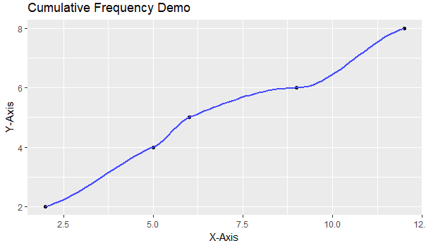
The code for the creation of such is below:
If were to employ this method while utilizing our example data vector 'F' to create a sample table, the output would resemble:
The code for the creation of such is below:
# Example Vector F' #
F <- c(5,12,9,12,5,6,2,2)
# The Code to Generate the Example Table #
qplot(unique(F), ecdf(F)(unique(F))*length(F), xlab='X-Axis', ylab='Y-Axis', main = "Cumulative Frequency Demo" , geom= c("point", "smooth"))
The Stemplot
Creating a Stemplot is much easier, the code for the creation of such is:
stem(<datasetcolumn or vector>)
If were to utilize this function on our example data vector 'F', the output would be:
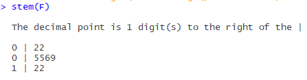
In the case of the stem plot, the output is generated and printed to the console window.
And the code to accomplish this example product is:
stem(F)
In the next article, I will continue to demonstrate various graphical models, and the code which enables their creation.
* https://www.youtube.com/watch?v=TwGYLQ-DNdc
** https://stackoverflow.com/questions/3544002/easier-way-to-plot-the-cumulative-frequency-distribution-in-ggplot
F <- c(5,12,9,12,5,6,2,2)
# The Code to Generate the Example Table #
qplot(unique(F), ecdf(F)(unique(F))*length(F), xlab='X-Axis', ylab='Y-Axis', main = "Cumulative Frequency Demo" , geom= c("point", "smooth"))
The Stemplot
Creating a Stemplot is much easier, the code for the creation of such is:
stem(<datasetcolumn or vector>)
If were to utilize this function on our example data vector 'F', the output would be:
In the case of the stem plot, the output is generated and printed to the console window.
And the code to accomplish this example product is:
stem(F)
In the next article, I will continue to demonstrate various graphical models, and the code which enables their creation.
* https://www.youtube.com/watch?v=TwGYLQ-DNdc
** https://stackoverflow.com/questions/3544002/easier-way-to-plot-the-cumulative-frequency-distribution-in-ggplot
No comments:
Post a Comment
Note: Only a member of this blog may post a comment.