Monday, September 18, 2017

(R) Multiple Linear Regression - Pt. (II)

In the previous article, we discussed linear regression. In this article, we will discuss multiple linear regression. Multiple linear regression, from a conceptual standpoint, is exactly the same as linear regression. The only fundamental difference, is that through the utilization of a multiple linear regression model, multiple independent variables can be assessed.

In this example, we have three variables, each variable is comprised of prior observational data.

x <- c(27, 34, 22, 30, 17, 32, 25, 34, 46, 37)
y <- c(70, 80, 73, 77, 60, 93, 85, 72, 90, 85)
z <- c(13, 22, 18, 30, 15, 17, 20, 11, 20, 25)


To integrate these variable sets into a model, we will use the following code:

multiregress <- (lm(y ~ x + z))

This code creates a new set ('multiregress'), which contains the regression model data. In this model, 'y' is the dependent variable, with 'x' and 'z' both represented as dependent variables.

We will need to run the following summary function to receive output information pertinent to the model:

summary(multiregress)

The output produced within the console window is as follows:

Call:
lm(formula = y ~ x + z)

Residuals:
    Min      1Q  Median      3Q     Max 
-6.4016 -5.0054 -1.7536  0.8713 14.0886 

Coefficients:
            Estimate Std. Error t value Pr(>|t|)   
(Intercept)  47.1434    12.0381   3.916  0.00578 **
x             0.7808     0.3316   2.355  0.05073 . 
z             0.3990     0.4804   0.831  0.43363   
---

Residual standard error: 7.896 on 7 degrees of freedom
Multiple R-squared:  0.5249, Adjusted R-squared:  0.3891 
F-statistic: 3.866 on 2 and 7 DF,  p-value: 0.07394

In this particular model scenario, the model that we would use to determine the value of 'y' is:

y = 0.7808x + 0.3990z + 47.1434

However, in investigating the results of the summary output, we observe that:

Multiple R-squared = 0.5249

Which can be a large enough coefficient, depending on what type of data we are observing...but the following values should raise some alarm:

p-value: 0.07394 (> Alpha of .05)

AND

F-statistic: 3.866 on 2 and 7 DF

Code: 

qf(.95, df1=2, df2=7) #Alpha .05#

[1] 4.737414

4.737414 > 3.866

If these concepts seem foreign, please refer to the previous article.

From the summary data, we can conclude that this model is too inaccurate to be properly accepted and utilized.

Therefore, I would recommend re-creating this model with new independent variables.

When creating multiple linear regression models, it is important to consider the values of the f-statistic and the coefficient of determination (multiple r-squared). If variables are being added, or exchanged for different variables within an existing regression model, ideally, the f-statistic and the coefficient of determination should rise in value. This increase indicates that the model is increasing in accuracy. A decline in either of these values would indicate otherwise.

Moving forward, new articles will cover less complicated fundamental aspects of statistics. If you understand this article, and all prior articles, the following topics of discussion should be mastered with relative ease. Stay tuned for more content, Data Heads!

Thursday, September 14, 2017

(R) Linear Regression - Pt. (I)

In this first entry of a two part article series, we will be discussing linear regression. In the next article, I will move on to the more advanced topic of multiple regression.

Regression analysis allows you to create a predictive model. This model can be used to ascertain future results based on the value of a known variable.

Let's begin with an example.

We have two sets of data:

x <- c(27, 34, 22, 30, 17, 32, 25, 34, 46, 37)
y <- c(70, 80, 73, 77, 60, 93, 85, 72, 90, 85)


To determine if there is a relationship between the data points of each set, we must first decide which variable is effecting the other. Meaning, one variable's value will determine the value of the other variable. In the case of our example, we have determined that the value of 'x', is impacting the value of 'y'. Therefore, 'x' is our independent variable, and 'y' is our dependent variable, as y's value is dependent of the value of 'x'.

We can now create a linear model for this data. The dependent variable must be listed first in this function followed by the independent variable.

linregress <- (lm(y ~ x))

'lingress'' is the name of the data set that we will use to store this model. To produce a model summary, which will contain the information necessary for analysis, we must utilize the following command:

summary(linregress)

This should output the following data to the console:

Call:
lm(formula = y ~ x)

Residuals:
   Min     1Q Median     3Q    Max 
-9.563 -4.649 -1.361  1.457 13.139 

Coefficients:
                   Estimate   Std. Error t value Pr(>|t|)    
(Intercept)  52.6319     9.8653   5.335 0.000698 ***
x                  0.8509     0.3144   2.707 0.026791 *  
---

Residual standard error: 7.741 on 8 degrees of freedom
Multiple R-squared:  0.478, Adjusted R-squared:  0.4128 
F-statistic: 7.327 on 1 and 8 DF,  p-value: 0.02679

Now to overview each aspect of the output.

Call: 

This is specifying the data that was "called" by the function.

Residuals:

A residual, is a value which represents the difference between the dependent value that is produced by the model, and the actual value of the dependent variable. These values are sorted in the way that is similar to the fivenum() function. For more information on this function, please consult prior articles.

However, there may be times that you would like to view the value of the residuals in their entirety. To achieve this, please utilize the function below:

resid(linregress)

This outputs the following to the console:


  1               2               3                4                 5              6                7                  8 
-5.606860 -1.563325  1.647757  -1.159631  -7.097625 13.138522 11.094987  -9.563325 
  9              10  
-1.774406  0.883905 


Coefficients 

Estimate 
(Intercept)  - This value is the value of the y-intercept.

Estimate 
x - This is the value of the slope.

With this information, we can now create our predictive model:

Y = 0.8509x + 52.6319


Y is the value of the dependent variable, and x is the value of the independent variable. If you enter the value of x into the equation, and work out the operations, you should recieve the predicted value of Y.

Std. Error
x - This value is the standard error of the slope value.

t value
x - This value is the standard error divided by the value of the coefficient. In our example, this value is comprised of the quotient 0.3144 / 0.8509 . The value of such is 2.707.

This allows us to create a t-test to check for significance. This particular test establishes a null hypothesis, which is utilized to check as to whether the slope has significance as it pertains to the model.

To obtain the t-test value to perform this evaluation, you will need to first determine the confidence interval that you wish to utilize. In this case, we'll assume 95% confidence, this equates an alpha value of .05.

Since the t-test that we will be performing is a two tailed test, we will enter the following code to receive our critcal value:

qt(c(.05/2), df=8)

In the above code, .05 is our alpha value, which is being divided by 2 due to the test requiring two tails. df=8 is the value of our degrees of freedom, these values can be found in the row output, which reads: "Residual standard error". This output specifies 8 degrees of freedom.

Since the t-value of our model (2.707), is greater than that t-test value itself (2.306004), we can state, that based on our confidence interval, the slope is significant as it pertains to our model.

p value
x - The p-value that is being indicated, is representative of the level of change dependent on the variable 'x'.

The lower the p-value, the greater the indication of this significance. We can test this value against a confidence interval, in this case, 95%, or alpha = .05. Since our p-value is 0.026791, which is smaller than the alpha value of .05, we can state, with 95% confidence, that this model is statistically significant.

Residual standard error:

This is the estimated standard deviation of the residual values.

There is some confusion as to how this value is calculated. It is important to note, that residual standard error is an ESTIMATED STANDARD DEVIATION. As such, degrees of freedom are
calculated as (n-p), and not (n-1). In the case of our model, if you were to calculate the standard deviation of the residuals with the function: SD(residual values), then the standard deviation value would be incorrect as it pertains to the model. *

F-Statistic 

One of the most important statistical methods for checking significance is the F-Statistic.

As you can see from the above output, the F-Statistic is calculated to be:

7.327

With this information, we can conduct a hypothesis test after deciding on an appropriate confidence interval. Again, we will utilize a confidence interval of 95%, and this provides us with an alpha value of .05.

Degrees of freedom are provided, those values are 1 and 8.

With this information, we can now generate the critical value in which to test the F-Statistic against. Typically this value would be found on a table within a statistics textbook, However, a much more accurate and expedient way of finding this value, is through the utilization of R software.

qf(.95, df1=1, df2=8) #Alpha .05#

This provides us with the console output:

5.317655

Since our F-Statistic of 7.327 is greater than the critical value of our test statistic 5.317655, we will not reject the null hypothesis at a 95% confidence interval. Due to such, we can conclude,
with 95% confidence, that the model provides a significant fit for our data.

The Value of The Coefficient of Determination

(Multiple R-Squared)

(Notated as: r)

The coefficient of determination can be thought of as a percent. It gives you an idea of how many data points fall within the results of the line formed by the regression equation. The higher the coefficient, the higher percentage of points the line passes through when the data points and line are plotted.**

In most entry level statistics classes, this is the only variable that is evaluated when determining model significance. Typically, the higher the value of the coefficient of determination, assuming that all other tests of significance are met, the greater the usefulness and accuracy of the model. This value can be any number from 0-1. A value of 1 would indicate a perfect model.

(Adjusted R-Squared)

This value is the adjusted coefficient of determination, its method of calculation accounts for the number of observations contained within the model. Adjusted r-squared, by its nature, will always be of a lesser value than its multiple r-squared equivalent.***

The Value of the Coefficient of Correlation

(notated as: r)

This value is not provided in the summary. However, there may be times when you would like to have this value provided. The code to produce this value is below:

cor(y, x)

This outputs the following value to the console:

[1] 0.6914018

Therefore, r = 0.6914018.

Graphing the Linear Regression Model


The following code can be utilized to create the graph of a linear regression model in R. In this case, we will be creating a graphical representation of our example model.

plot(x, y, xlab="X-Value", ylab="Y-Value", main="Linear Regression Example")
abline(linregress)

* For more information on the standard error of the regression - 
http://blog.minitab.com/blog/adventures-in-statistics-2/regression-analysis-how-to-interpret-s-the-standard-error-of-the-regression

** http://www.statisticshowto.com/what-is-a-coefficient-of-determination/

*** https://en.wikipedia.org/wiki/Coefficient_of_determination#Adjusted_R2

Monday, September 4, 2017

(R) Chi-Square


Chi-Square is an often overlooked concept in statistics. It has many uses, as will be demonstrated in this article. The first essential aspect of understanding Chi-Square is to understand its pronunciation. Many would assume that the pronunciation is "C-HI", or "ChEE". Neither is correct, the proper pronunciation is “Kai". Next, let’s examines how a Chi-Square distribution appears when graphed.


Above is a graphical representation of the chi-square distribution. What is being illustrated is the probability densities of various chi-square distributions based on degrees of freedom.

Things to remember about the Chi-Squared Distribution:

1. It is a continuous probability distribution.

2. It is related to the standard normal distribution.

3. Degrees of freedom for a sample chi-square distribution will be the total number of independent standard normal variables minus one. 


The chi-squared distribution is utilized for goodness-of-fit tests. Meaning, that it is used to test one set of data against another. This is undertaken in order to determine whether a model of predictability is accurate. The degrees of freedom (n-1), or the size of the sample minus one, determines the shape of the probability density curve. Alpha, or 1 minus the confidence interval, will determine the size of the rejection region. This region is defined as the right most area beneath the distribution curve. The chi-square value, is derived from utilizing a mathematical function. Once derived, this value is matched against a chi-square distribution table. The chi square value, in conjunction with the determined degrees of freedom and the alpha value, ultimately determine as to whether a relationship may be assumed to exist.

Example:

A small motel owner has created a model which he believes, is an accurate predictor of individuals who will stay at his establishment. He presents you with his findings:

Monday: 20
Tuesday: 28
Wednesday: 18
Thursday: 25
Friday: 16
Saturday: 22
Sunday: 26

The following week, you are tasked with keeping track of guests who rent rooms at the motel. Here are your findings:

Monday: 14
Tuesday: 25
Wednesday: 22
Thursday: 18
Friday: 16
Saturday: 24
Sunday: 30

Given your findings, and assuming a 95% confidence interval, can we assume that the motel owner's model is an accurate predictor?

Model <- c(20, 28, 18, 25, 16, 22, 26)

Results <- c(14, 25, 22, 18, 16, 24, 30)

chisq.test(Model, p = Results,  rescale.p = TRUE)

Console Output:

Chi-squared test for given probabilities

data: Model
X-squared = 6.5746, df = 6, p-value = 0.362

Findings:

Degrees of Freedom (df) - 6
Confidence Interval (CI) - .95
Alpha (α) (1-CI) - .05
Chi Square Test Statistic - 6.5746

This creates the hypothesis test parameters:

H0 : The model is a good fit (Null Hypothesis).

The critical value of 12.59 is found when consulting the chi-square distribution table. Since our chi-square value is less than this value (6.5746 < 12.59), we can state, that with 95 % confidence, that the owner's model is accurate.

Cannot Reject: Null Hypothesis.

Example:

The same small motel owner also created an additional model which he believes, is an accurate predictor of individuals who will stay at his establishment. He presents you with his findings:

Monday: 10%
Tuesday: 5%
Wednesday: 20%
Thursday: 10%
Friday: 20%
Saturday: 30%
Sunday: 5%

(Predicted percentage of total individuals who will stay throughout the week)


The following week, you are tasked to keep track of guests who rent rooms at the motel. Here are your findings:

Monday: 11
Tuesday: 25
Wednesday: 30
Thursday: 13
Friday: 23
Saturday: 17
Sunday: 8

(Actual number of individuals who stayed throughout the week)

Given your findings, and assuming a 95% confidence interval, can we assume that the motel owner's model is an accurate predictor?

Model <- c(.10, .05, .20, .10, .20, .30, .05)

Results <- c(11, 25, 30, 13, 23, 17, 8)

chisq.test(Results, p=Model, rescale.p= FALSE)

Console Output:

Chi-squared test for given probabilities

data: Results
X-squared = 68.184, df = 6, p-value = 9.634e-13

Findings:

Degrees of Freedom (df) - 6
Confidence Interval (CI) - .95
Alpha (α) (1-CI) - .05
Chi-Square Test Statistic - 68.184

This creates the hypothesis test parameters:

H0 : The model is a good fit (Null Hypothesis).

The critical value 12.59, is found when consulting the chi-squared distribution table. Since our chi-square value is greater than this value (68.184 > 12.59), we cannot state, that with 95 % confidence, that the owner's model is inaccurate.

Reject: Null Hypothesis.

Example:

While working as a statistician at a local university, you are tasked to evaluate, based on survey data, the level of job satisfaction that each member of the staff currently has for their occupational role. The data that you gather from the surveys is as follows:

General Faculty
130 Satisfied 20 Unsatisfied

Professors
30 Satisfied 20 Unsatisfied

Adjunct Professors
80 Satisfied 20 Unsatisfied

Custodians
20 Satisfied 10 Unsatisfied

The question remains however, as to whether the assigned role of each staff member, has any impact on the survey results. To decide this, with 95% confidence, you must follow the subsequent steps.

First, we will need to input this survey data into R as a matrix. This can be achieved by utilizing the code below:

Model <- matrix(c(130, 30, 80, 20, 20, 20, 20, 10), nrow = 4, ncol=2)

The result should resemble:

Once this step has been completed, the next step is as simple as entering the code:

chisq.test(Model)

Console Output:

Pearson's Chi-squared test

data: Model
X-squared = 18.857, df = 3, p-value = 0.0002926

Findings:

Degrees of Freedom (df) - 3
Confidence Interval (CI) - .95
Alpha (α) (1-CI) - .05
Chi Square Test Statistic - 18.857

This creates the hypothesis test parameters:

H0 : There is no correlation between job type and job satisfaction (Null Hypothesis). Job type and job satisfaction are independent variables.

HA: There is a correlation between job type and job satisfaction. Job type and job satisfaction are not independent variables.

The critical value 7.815 is found when consulting the chi squared distribution table. Since our chi square value is greater than this value (18.857 > 7.815), we can state, that with 95 % confidence, that there is a correlation between job type and overall satisfaction.

Reject: Null Hypothesis.

* Source for Chi Square Distribution Image - https://en.wikipedia.org/wiki/Chi-squared_distribution

Monday, August 28, 2017

(R) The Normal Distribution - Pt. II

Now that you understand how to identify a normal distribution, we can utilize R to perform calculations that are specific to this distribution type.

When a normal distribution has been identified, we can estimate the probability that an event takes place as it occurs between two values.

I am assuming that you have some understanding of normal distributions in addition to what was discussed in the prior entry.

Example:

You are currently employed as a statistician in a factory that produces flashlights. The senior statistician informs you that the premium brand of flashlights that the factory produces, have a battery life expectancy which is normally distributed. The mean for the battery life of this particular brand is 20 hours, with a standard deviation of 5 hours.

What is the probability that a randomly selected flashlight from the production line will last between 20-25 hours?

pnorm(q=25, mean=20, sd=5, lower.tail=TRUE)

# Output = 0.8413447 #

0.8413447 - .50

# 0.3413447 or % 34.134 Probability #

If a flashlight's battery dies at exactly 8 hours after use, how many standard deviations away from the mean is this value?

# (x - mean) / standard deviation #

(8 - 20) / 5

# - 2.4 Standard Deviations #

What is the probability that a randomly selected flashlight from the production line will last between 18-24 hours?

pnorm(q=18, mean=20, sd=5, lower.tail=FALSE)

# Output = 0.6554217 #

0.6554217 - .50

# Output = 0.1554217 #

pnorm(q=24, mean=20, sd=5, lower.tail=TRUE)

# Output = 0.7881446 #

0.7881446 - .50

# Output = 0.2881446 #

0.2881446 + 0.1554217

# 0.4435663 or % 44.357 Probability #

What is the probability that a randomly selected flashlight from the production line will last between 22-26 hours?

pnorm(q=22, mean=20, sd=5, lower.tail=FALSE)

# Output = 0.3445783 #

.50 - 0.3445783

# Output = 0.1554217 #

pnorm(q=26, mean=20, sd=5, lower.tail=TRUE)

# Output = 0.8849303 #

0.8849303 - 0.1554217 - .50

# 0.2295086 or % 22.950 Probability #


At the same factory, while eating lunch, the senior statistician appears again. During this encounter, he decides to test your statistical abilities by asking you a series of questions.

These questions are:

Given a normal distribution with a mean of 55, what is the standard deviation if 45% of the values are above 70?

qnorm(.45, lower.tail=FALSE)

# Output = 0.1256613 #


70 - 55

# Output = 15 #

15 / .1256613

# Standard Deviation = 119.3685 # 

Given a normal distribution with a standard deviation of 15, what is the mean if 25% of the values are below 45?

qnorm(.25, lower.tail = FALSE)

# Output = 0.6744898 #

45 + (0.6744898 * 15)

# Output = 55.11735 #

Given a normal distribution with 60% of the values above 100, and 90% of the values above 80, what are the mean and the standard deviation?

qnorm(.60, lower.tail=TRUE)

# Output = 0.2533471 #

qnorm(.90, lower.tail=TRUE)

# Output = 1.281552 #

# (100 - Mean)/Standard Deviation = 0.2533471 #
# (80 - Mean)/Standard Deviation = 1.281552 #

# 100 - Mean = 0.2533471 * Standard Deviation #
# 80 - Mean = 1.281552 * Standard Deviation #

Which can be worked out, algebraically, to solve for both mean and standard deviation.

That is all of this entry, which closes out the 50th article that I have written for this blog. Two things to remember about normal distributions: there is no perfect test for normality, and there is no way to provide a probability for a single event occurring within a continuous normal distribution. All that we can find, is the probability surrounding an event's parameters.

Stay tuned until next time, Data Heads.

Sunday, August 27, 2017

(R) Identifying Normally Distributed Data - Pt. I


A good portion of statistics, as it is taught in the academic setting, focuses specifically on a single aspect of the subject matter, that aspect being the normal distribution. Normal distributions often occur in very large observational sets, however, there are also instances where a small observational pattern may exhibit characteristics of a normal distribution. Once a set is identified as conforming to this distribution type, various inferences can be made about the data, and various modeling techniques can be applied.

For this article, we will be using the sample data set: "SDSample":

SDSample <- c(7.00, 5.10, 4.80, 2.90, 4.80, 5.80, 6.40, 6.10, 4.30, 7.20, 5.30, 4.00, 5.50, 5.40, 4.70, 4.50, 5.00, 4.70, 6.10, 5.10, 5.20, 5.00, 4.20, 5.10, 4.90, 5.30, 2.90, 5.80, 3.50, 4.90, 5.80, 6.10, 3.00, 5.90, 4.30, 5.30, 4.70, 6.40, 4.60, 3.50, 5.00, 3.50, 4.10, 5.70, 4.90, 6.10, 5.30, 6.90, 4.60, 4.90, 4.00, 3.90, 4.50, 5.90, 5.20, 7.20, 4.60, 4.40, 5.40, 5.90, 3.10, 5.60, 5.10, 4.40, 4.50, 3.10, 4.50, 6.00, 6.00, 5.10, 7.30, 4.60, 3.20, 4.10, 5.10, 4.90, 5.10, 5.60, 4.10, 5.70, 4.70, 5.70, 5.50, 4.50, 5.20, 5.00, 5.40, 5.10, 3.90, 4.30, 4.10, 4.30, 4.40, 2.40, 5.40, 6.30, 5.50, 4.30, 4.90, 2.90)

Creating a Frequency Histogram

Assuming that "SDSample" contains sample observation data, our first in analyzing the data in order to check for normality, is to create a histogram.

hist(SDSample,
freq = TRUE,
col = "Blue",
xlab = "Vector Values",
ylab = "Frequency",
main = "Frequency Histogram")


The output should resemble:


Shapiro-Wilk Normality Test

After viewing the histogram, we should proceed with performing a Shapiro-Wilks Test. This can be achieved with the following example code:

shapiro.test(SDSample)

This produces the following console output:

Shapiro-Wilk normality test

data: SDSample
W = 0.98523, p-value = 0.3298


But what does this mean?

Without an assumed alpha level, it means nothing at all. However, with a determined alpha level, a hypothesis test can be created which tests for normality. We will assume an alpha value of

Well, assuming an alpha value of .05 (α = .05), or stating that we wish to, with 95% confidence, state that the data does fit a normal distribution...through the use of the Shapiro-Wilk normality test, we can create a hypothesis test to prove just that.

If P <= .05 we would reject the null hypothesis, meaning, that we could state that:

With 95% confidence the data does not fit the normal distribution.

If P > .05, we would accept the hypothesis, meaning, that we could state that:

No significant departure from normality was found.

In this case, P = 0.3298, and 0.3298 > .05, therefore, we can state:

No significant departure from normality was found.

THE RESULTS OF THIS TEST DO NOT MEAN THAT THIS DATA WAS TAKEN FROM A SOURCE WHICH WAS NORMALLY DISTRIBUTED. NOR DOES IT INDICATE THAT THE DATA ITSELF IS NORMALLY DISTRIBUTED. IT SIMPLY STATES THAT:

Assuming an Alpha Value of .05, and applying the Shapiro-Wilk normality test, no significant departure from normality was found.

However, since the test is biased by sample size, the test may indicate statistically significant results in a large samples, even when this is not the case. Thus a Q-Q plot is required for verification in addition to the test. *

Q-Q Plot

As previously mentioned, the size of the data set that Shapiro-Wilk normality test is applied to can have a significant impact on its accuracy. This is why Q-Q plot utilization is recommended to double check the results of the test.

To create a Q-Q plot, please utilize the sample code:

qqnorm(SDSample, main="")
qqline(SDSample)


This should produce the following output:


Ideally, if the data is normally distributed, the dotted plots should follow the solid trend line as closely as possible.

The Q-Q plot is reasonably consistent with normality.

For more information on how to interpret the Q-Q plot, please click on the link below:

http://data.library.virginia.edu/understanding-q-q-plots/

Plotting The Probability Density of A Normal Distribution

Before proceeding with this coding sample, I want to be clear, that this method does not produce a Kernel Density Plot. Meaning, that the method that is presented below, will take any number of data points and plot them as if the distribution was perfectly normalized. Therefore, this graphical representation only serves as just that. Any data that is subject to the methods below will be graphed as if it the data selection occurred within a normal distribution.

First we will need to find the mean of the data vector:

mean(SDSample)

# mean = 4.940 #

Then we need to derive the standard deviation.

sd(SDSample)

# sd = 0.9978765 #

# Now we will assign the ‘SDSample’ vector to vector "x" #

x <- SDSample

# This code produces a new vector which consists of the probability density values of all "SDSample" data vector values. It does so under the assumption, that these values occurred within a normal distribution with a mean value of 4.940, and a standard deviation of 0.9978765 #

y <- dnorm(SDSample, mean = 4.940, sd = 0.9978765)

# This code plots the distribution #

plot(x,y, main="Normal Distribution / Mean = 4.940 / SD = .998", ylab="Density", xlab="Value", las=1)

# This code creates a vertical line on the plot which indicates the position of the mean value #

abline(v=4.940)

From this code, we are presented with the image:


Kernel Density Plot

In this graphic, what is being illustrated, is the density of independently occurring values on the x-axis. Notice that the illustration is not perfectly bell shaped. This was not going to be initially include this as part of this article, but I feel that it should be presented due to its significance, and also, to demonstrate how it differs from the previous example.

d <- density(SDSample)
plot(d, main ="Kernel Density of X")
polygon(d, col="grey", border="blue")


The output would be:


In the next article, we will discuss inferences that can be made pertaining to normally distributed data, and methods which can be utilized to draw further conclusions.

* https://en.wikipedia.org/wiki/Shapiro%E2%80%93Wilk_test

Monday, August 21, 2017

(R) The Poisson Distribution


In this article, we will be discussing The Poisson distribution. The Poisson distribution is a discrete distribution, and is similar to the binomial distribution. However, the Poisson distribution applies to occurrences over a specified interval. The random variable 'x' is the number of occurrences of the event in an interval.

μ or λ = (Mean or Lambda) The average number of occurrences of the event over the interval.

x = The number of occurrences of the event over the interval.

Requirements

The random variable 'x' is the number of occurrences of an event over some interval.

The occurrences must be random.

The occurrences must be independent from each other.

The occurrences must be uniformly distributed over the interval being used (cannot be seasonal).

Differences from a Binomial Distribution

The Possion distribution differs from the binomial distribution in these fundamental ways:

The binomial distribution is affected by the sample size 'n' and the probability 'p', whereas the Poisson distribution is affected only by the mean.

In a binomial distribution the possible values of the random variable x are 0,1,...,n, but a Poisson distribution has possible 'x' values of 0,1,2..., WITH NO UPPER LIMIT! (emphasis added)

* Source for the above material: https://www.youtube.com/watch?v=BR1nN8DW2Vg 
   User: DrCraigMcBridePhd Video: "Statistics - Binomial & Poisson Distributions" 

Example in R:

Let's say, that every Tuesday in spring, for 8 hours, your web camera films for blue birds which frequent your garden. You have counted these blue birds, and over the course of the season, have noticed an average of 12 blue birds visiting your garden each day.

What is the probability that EXACTLY 8 blue birds will visit your garden given the parameters of the experiment?

P(x) = 8
λ = 12

In R, this would be expressed in the code below:

dpois(x=8, lambda=12)

Which would generate the result of:

[1] 0.06552328

What is the probability that exactly 0 blue birds will visit?
What is the probability that exactly 1 blue bird will visit?
What is the probability that exactly 2 blue birds will visit?
What is the probability that exactly 3 blue birds will visit?

In R, this would be expressed in the code below:

dpois(x=0:3, lambda=12)

Which would generate the result of:

[1] 6.144212e-06 7.373055e-05 4.423833e-04 1.769533e-03

What is the probability that 6 or less blue birds will visit your garden?

P(x <= 6)
λ = 12

In R, this would be expressed in the code below:

sum(dpois(x=0:6, lambda=12))

or

ppois(q=6, lambda=12, lower.tail=T)

Either, which would generate the result of:

[1] 0.04582231

What is the probability that more than 6 blue birds will visit your garden?

P(x  > 6) 
λ = 12

In R, this would be expressed in the code below:

ppois(q=6, lambda=12, lower.tail=F)

Which would generate the result of:

[1] 0.9541777

Alternatively, you could also utilize any of the following lines of code and achieve the same result:

1 - sum(dpois(x=0:6, lambda=12))

sum(dpois(x=138, lambda=12))


In the next article we will discuss the normal distribution. I hope to see you then. All the best, data monkeys.

(R) Binomial Distribution


What R lacks in graphical capability, it makes up for in analysis, which in my opinion, is of far greater importance. Today we will discuss R's ability to streamline binomial distribution analysis.

For our example, let’s say that you have five dice. Each die has six faces, and each of those faces contains a number (1,2,3,4,5,6).

Now, for our example to qualify as a binomial probability distribution, it must meet ALL of the following requirements:

Requirements

1. The procedure has a fixed number of trials.

2. The trials must be independent.

3. Each trial must have all outcomes classified into two categories (success or failure).

4. The probability of a success remains the same in all trials.

Notation

Notation for probability distributions is as follows:

p = Probability of success. (one trial)

q = Probability of failure. (one trial)

n = Fixed number of trials.

x = The number of successes in ’n' trials.

P(x) = the probability of getting exactly ‘x’ successes among the ’n’ trials.

* Source for the above material: https://www.youtube.com/watch?v=BR1nN8DW2Vg 
   User: DrCraigMcBridePhd Video: "Statistics - Binomial & Poisson Distributions" 

So, for the sake of our example, let's say that we want to know the probability of rolling all five dice, one after the other, and having each face land showing the "6" side.

Therefore:

p = 1/6 (1 out of 6 chance that a roll of "6" will occur on one die.)

q = 5/6 (5 out of 6 chance that it will not.)

n = 5 (5 rolls will be made.)

x = 5 (5 rolls of "6" are needed.)

P(x=5) = ??? (What is the probability that all 5 rolls will show a face of "6"?)

In R, this would be expressed in the code below:

dbinom(x=5, size=5, prob=1/6)

Which would generate the result of:

[1] 0.0001286008

How about we try the same experiment, with the same parameters, except this time, we want to know the probability of rolling a “5” or a “6” on any die. Again, we will be rolling each of the 5 dice once.

# p = 2/6 (2 out of 6 chance that a roll of "6" or "5" will occur on one die.) #

# q = 4/6 (4 out of 6 chance that it will not.) #

# size (n) = 5 (5 rolls will be made.) #

# x = 5 (5 rolls of "6" or "5" are needed.) #

# P(x=5) = ??? (What is the probability that all 5 rolls will show a face of "5" or "6"?) #

# In R, this would be expressed in the code below: #

dbinom(x=5, size=5, prob=2/6)


Which would generate the result of:

[1] 0.004115226

# Now let's check the probability of not rolling a "6" on one die, given 5 trials. #

# prob = probability that event will not occur #

# The probability of NOT rolling a "6" on one die, one roll #

dbinom(x=1, size=1, prob=5/6)


Which would generate the results:

0.8333333

# Also could run the following code in each instance: #

# prob = probability that event will occur #

1 - dbinom(x=1, size=1, prob=1/6)

# The probability of NOT rolling a "6" on 2 dice, given 2 dice being separately rolled. #

dbinom(x=2, size=2, prob=5/6)

# The probability of NOT rolling a "6" on 3 dice, given 3 dice being separately rolled. #

dbinom(x=3, size=3, prob=5/6)

# The probability of NOT rolling a "6" on 4 dice, given 4 dice being separately rolled. #

dbinom(x=4, size=4, prob=5/6)

# The probability of NOT rolling a "6" on 5 dice, given 5 dice being separately rolled. #

dbinom(x=5, size=5, prob=5/6)


# Finally, let's say that you wanted to know the probability of rolling two or less "6"'s on a die face given… #

# 5 separate rolls of 5 dice #

# p = 1/6 (1 out of 6 chance that a roll of "6" will occur on one die.) #

# q = 5/6 (5 out of 6 chance that it will not.) #

# n = 5 (5 rolls will be made.) #

# x<=2 = (2 rolls of "6" are needed.) #

# P(x<=2) = ??? (What is the probability that two dice or less show the face "6"?) #

# In R, this would be expressed in the code below: #

sum(dbinom(x=0:2, size=5, prob=1/6))

# or #

dbinom(x=0, size=5, prob=1/6) + dbinom(x=1, size=5, prob=1/6) + dbinom(x=2, size=5, prob=1/6)

# or: #

pbinom(q=2, size=5, prob=1/6, lower.tail = TRUE)


Each method would produce the result of:

[1] 0.9645062

# What is the probability that 3 dice or more show the face "6"? #

dbinom(x=3, size=5, prob=1/6) + dbinom(x=4, size=5, prob=1/6) + dbinom(x=5, size=5, prob=1/6)

# or #

pbinom(q=2, size=5, prob=1/6, lower.tail = FALSE)

# or #

1 - pbinom(q=2, size=5, prob=1/6, lower.tail = TRUE)

# or #

1 - sum(dbinom(x=0:2, size=5, prob=1/6))


Each method would produce the result of:

[1] 0.9645062


Conversely, you could also generate a result which indicates the value of the probability of
2 dice having a value of "6", given five dice.

# In R, this would be expressed in the code below: #

dbinom(x=2, size=5, prob=1/6)

Which would produce the result of:

[1] 0.160751

In the next article, I will discuss a similar concept, known as the "Poisson Distribution". Stay tuned data enthusiasts.

(R) Bar Plots

In today's entry, I will briefly explain how to create basic bar plots. In future entries, the subject matter which I will cover, will pertain to formula based analysis. To re-iterate, if given the option, I would recommend creating most graphical representations through the utilization of non R related software.

The example data that we will be utilizing to create our example graphics is below:

Test1 <- c("Yes", "Yes", "Yes", "No", "No", "Yes", "No", "Yes", "No", "Yes", "Yes", "Yes", "No")

Test2 <- c("No", "No", "No", "Yes", "Yes", "Yes", "No", "No", "Yes", "Yes", "Yes", "No", "Yes")

CSVColors <- data.frame(Test1, Test2)


In the case of our first example, we will graph the first column, "Test1".

Test1 <- table(CSVColors$Test1)

In R, you have the option of selecting specific colors from which to color your bar plot. R recognizes most color names, to set up a color scheme for your graph, you may utilize the following code:

graphcol <- c("<color1>", "<color2>", "<color3>", etc.)

"graphcol" is the name of the vector that I selected for our example bar plot. However, if you'd prefer, you could use a different vector name of your choosing. As long as the "col=" option equals the name of the vector which contains the color selections, the colors should be properly applied to the graph.*

In our example, we will use the colors "Grey" and "Maroon".

graphcol <- c("grey", "maroon")

Now let's specify, within our code, that we would like these colors to be utilized:

barplot(Test1,
main="Vert Bar Plot Example", xlab="X-Axis",
ylab="Y-Axis", col=graphcol)


This should create the output:


If we would instead like to create a horizontal bar plot, the code would be modified to:

barplot(Test1,
main="Horiz Bar Plot Example", xlab="X-Axis",
ylab="Y-Axis", col=graphcol, horiz=TRUE)


The output that the above code creates is:


There are other options that can be selected to further customize the bar plot graphs. However, in this article, my goal was to simply present the basics. Again, if given the option, I would heavily suggest using a different program to graph results.

Wednesday, August 16, 2017

(R) Stemplot and Cumulative Frequency Plot

Today we will be discussing two very important graph types. The first graph is known as The Stemplot, or The Stem and Leaf Display. This representation is commonly used when preparing statistical data by hand, as it assists in the organization of data by numerical value. The second graph type that we will examine is known as The Cumulative Frequency Plot. This graph type is less common, but still finds use when comparing distribution data.

I will begin by discussing the more difficult of the two graph types, The Cumulative Frequency Plot. Learning how to decipher what is being illustrated in this display can be difficult to understand initially, as this type of graphical representation is not inherently intuitive. For this reason, I have included a link at the bottom of this article, which explains how to properly assess such a plot.*

Cumulative Frequency Plot

Before we begin, I should mention that R’s ability, as it pertains to the creation of Cumulative Frequency Plots, is rather limited. There are no built in functions which assist in creation of this graph type. There are auxiliary libraries, which do provide some useful features that can be utilized in tandem to create Cumulative Frequency Plots, however, utilizing these libraries in this manner is cumbersome and complicated. Therefore, if employed in an enterprise setting, I would recommend using a different program to create this type of graph.

After scouring the internet for a few hours and consulting the various R books in my possession, this was the best method that I could find for creating Cumulative Frequency Plots. This method was originally posted by a user named: "Yang", on the website: "Stack Exchange". A link to the original post can be found below. **

For this code to work, you will need to first download the R library, “ggplot2”.

qplot(unique(<datasetcolumn or vector>), ecdf(<datasetcolumn or vector>)(unique(<datasetcolumn or vector>))*length(<datasetcolumn or vector>), xlab='X-Axis', ylab='Y-Axis', main = "Cumulative Frequency Demo" , geom= c("point", "smooth"))

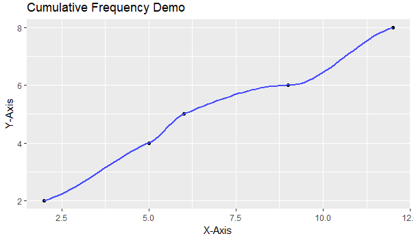
If were to employ this method while utilizing our example data vector 'F' to create a sample table, the output would resemble:


The code for the creation of such is below:

# Example Vector F' #

F <- c(5,12,9,12,5,6,2,2)

# The Code to Generate the Example Table #

qplot(unique(F), ecdf(F)(unique(F))*length(F), xlab='X-Axis', ylab='Y-Axis', main = "Cumulative Frequency Demo" , geom= c("point", "smooth"))

The Stemplot


Creating a Stemplot is much easier, the code for the creation of such is:

stem(<datasetcolumn or vector>)

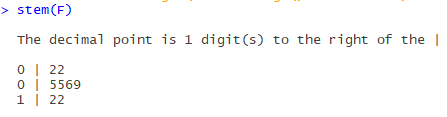
If were to utilize this function on our example data vector 'F', the output would be:


In the case of the stem plot, the output is generated and printed to the console window.

And the code to accomplish this example product is:

stem(F)

In the next article, I will continue to demonstrate various graphical models, and the code which enables their creation.

https://www.youtube.com/watch?v=TwGYLQ-DNdc

** https://stackoverflow.com/questions/3544002/easier-way-to-plot-the-cumulative-frequency-distribution-in-ggplot

Tuesday, August 15, 2017

(R) Histogram and Box Plot

As promised, today we will be discussing two types of R graphs, The Histogram and The Box Plot. I also have created an R function that can be utilized to distinguish outliers.

Box Plot

For this example, we will be using data vector 'F'. Feel free to follow along, the code that creates vector ‘F' is below:

F <- c(5,12,9,12,5,6,2,2)

To create a vertical box plot, the following example code can be utilized:

boxplot(F, main="Box Plot", ylab="Box Plot Demo")

F: is the data vector.
‘main =‘ Displays the title of the graph.
‘ylab =‘ Provides the title of the y-axis.


If we were to graph vector 'F' through the utilization of the code above, the output would resemble:


If you wanted to use the same vector to create a horizontal box plot, you would use this set of code:

boxplot(F, main="Box Plot",  xlab="X-Axis title",  ylab="Box Plot Demo", horizontal = TRUE )

The outcome of the above code resembles:


In this case, we adding an x-axis title with 'xlab=', and additionally, we are also changing the 'horizontal=' option to TRUE. By default, this option is FALSE.

These are just basic examples of box plots, there are many other features and customizable options that can be utilized to create the perfect box plot for your needs. If would like more information on these options, please utilize the '?boxplot' option within R.

Tracking Outliers

In R, outliers for box plots are defined as values that fall 1.5 * IQR below the first quartile, and 1.5 * IQR above the third quartile. Though these appear in the graph, they are not defined by R when plotted. To find out what these outlier values are, if such values exist, I have created the following function:

OutlierFunction <- function(t) {

q1 <- fivenum(t)
q1 <- q1[2] #Q1

q3 <- fivenum(t)
q3 <- q3[4] #Q3

iqrange <- q3 - q1

out1 <<- (q1 - (iqrange * 1.5))
out2 <<- (q3 + (iqrange * 1.5))

lowout <<- subset(t, t < out1, na.rm=TRUE )
highout <<- subset(t, t > out2, na.rm=TRUE )

}


The vector, or data frame column that you wish to assess, must be passed into the function through the utilization of the call:

OutlierFunction(<dataframecolumn or vector>)

The outliers which fall below the left whisker of the box plot are stored in the permanent data vector 'lowout'. The outliers which are above the right whisker of the box plot are stored in the permanent data vector 'highout'.

Histograms

I have created two examples which demonstrate R's capacity to create histograms.

This example demonstrates a histogram which measures density along the Y-Axis:

hist(F,
freq = FALSE,
col = "Green",
xlab = "X-Axis Label",
main = "Hist Demo")

F: is the data vector.
'freq =' Specifies the histogram type.
'col =' Specifies the color of the graph.‘xlab =‘ Provides the title of the x-axis.
‘main =‘ Displays the title of the graph.

Here is the graphical output for this example code:


This example demonstrates a histogram which measures frequency along the X-Axis:

hist(F,
freq = TRUE,
breaks = 4,
col = "orange",
xlab = "X-Axis Label",
main = "Hist Demo")

F: is the data vector.
'freq =' Specifies the histogram type.
‘breaks =‘ Specifies the number of cells of the histogram.
'col =' Specifies the color of the graph.‘xlab =‘ Provides the title of the x-axis.
‘main =‘ Displays the title of the graph.

Here is the graphical output for this example code:


The main differentiation between the two is the 'freq=' option. If the option is labeled as TRUE, the histogram plots frequency. If FALSE, the histogram plots density.

Additionally, there are times that you may want to add vertical lines to assess central tendency. The code for adding these lines to an existing histogram can be found below:

# Adds a black line with a width of '3' which indicates the mean value #
abline(v=mean(F), col="black", lwd = 3)

# Adds a red line with a width of '3' which indicates the median value #
abline(v=median(F), col="red", lwd = 3)

In the next entry, I will discuss Stem and Leaf Plots and Central Frequency Plots.